App Store Product Page: 15 Elements That Impact Your ASO and iOS App Visibility
The App Store product page is the main destination for iOS user acquisition across organic and paid channels. This guide explains its layout and components, why they matter for app store optimization (ASO), and how to improve your app's conversion and downloads with practical tips.


What is App Store product page?
The App Store product page is the app’s public listing on the Apple App Store where people see its name, visuals, details, and download button, and decide whether to install.
What are the product page layout and its components?
The product page has a simple layout made up of sections that help people discover an app and decide if it fits their needs. The most influential parts for App Store optimization are the icon, app name, subtitle, screenshots, and app preview video because they form the first impression and affect conversion the most.
The layout has changed over time, and the current design puts important visuals and text up front so people can evaluate the app quickly. Each section plays a role in discovery and conversion, so improving high-impact elements usually leads to better results.
The page can also show different things based on context, such as whether someone is new or already uses the app, the device type, and other conditions. Because of this, some assets may appear only for certain users or in specific situations.
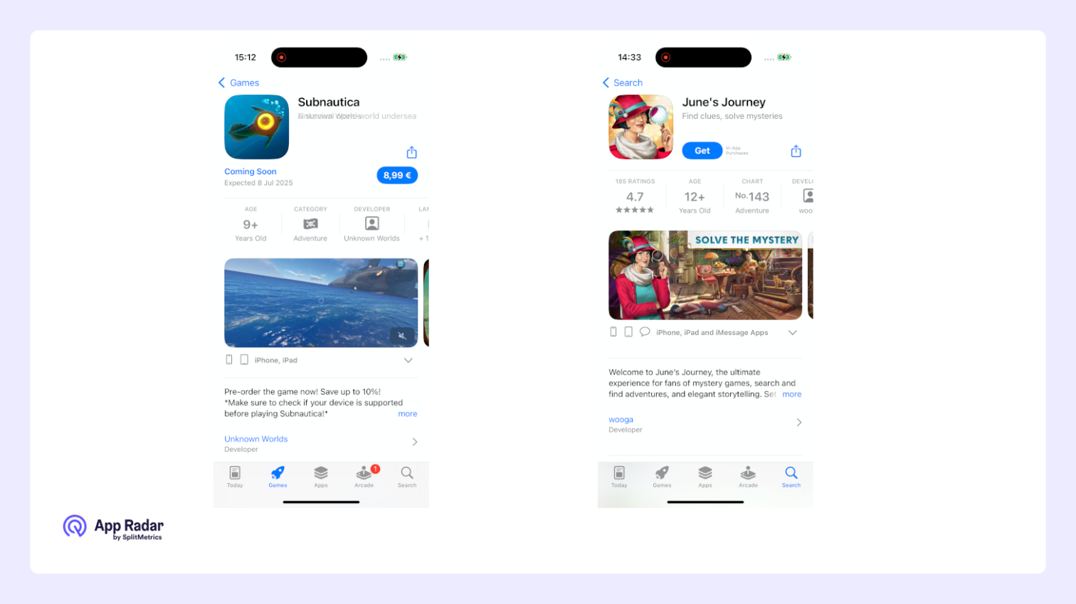
App icon
The app icon is a small graphic that represents an app across the App Store, including search results, the product page, and featured lists. It is a core ASO asset because it can influence tap‑through and conversion rates.
How should the app icon be designed?
Keep the icon design clean and easy to recognize. Most icons use imagery only, but there are cases where adding elements can make sense, such as a year to mark an anniversary, a small badge for a special update, or the developer’s logo.
App name
The app name is the primary title of the app and must accurately reflect what the app does. It is a critical ASO element because it strongly influences rankings in App Store search results. It also shapes brand perception, so the goal is to balance a distinctive brand name with clarity for search.
How should the app name be written?
Aim for a unique name paired with a short, practical descriptor when needed, so users understand the app’s purpose at a glance. Keep the wording clear, readable, and free of unnecessary or misleading terms, while sticking to the limit of 30 characters.
App subtitle
The app subtitle is a short phrase shown directly below the app name that explains the app’s value or key features. It is important for both discoverability and user understanding because it appears alongside the name in key App Store surfaces.
How important is the subtitle for ASO?
The subtitle is the second most important organic ranking field after the app name, and it can also affect tap‑through and conversion. It should use relevant, readable keywords that support the name without repeating it. Just like app name, it’s length is also limit to 30 characters.
App preview video
The preview video is a short video that promotes an app or game and appears in App Store search results and before screenshots on the product page, helping people understand value quickly when motion is clearer than static images. It should be added when key features or flows are hard to convey through screenshots alone, so the video clarifies how the app works in seconds.
How does a preview video impact ASO and conversion?
The impact varies by category, with videos frequently benefiting mobile games and sometimes producing mixed results for utilities or content apps if they slow evaluation or feel generic. Because videos can help or hurt conversion depending on execution and audience, it is best to test performance and iterate based on real metrics.
What are Apple’s key requirements?
App preview videos must use captured in‑app footage from the device, accurately reflecting the user experience without simulated UI or misleading content. Videos autoplay muted on the App Store, support up to three previews per locale, and are typically 15–30 seconds each, so on‑screen titles and captions must be readable without sound.
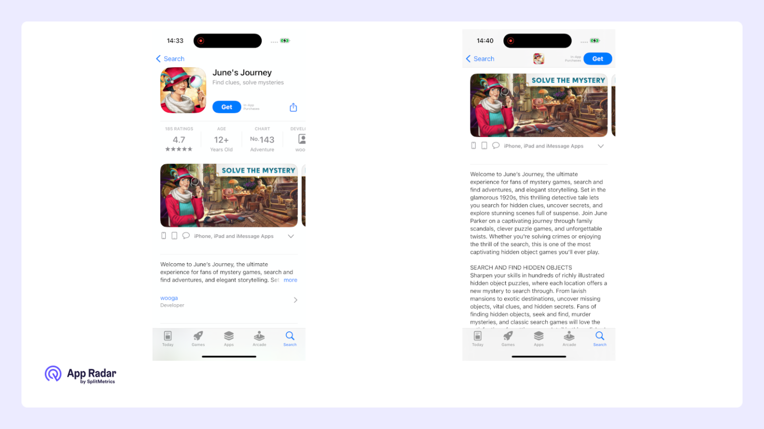
App screenshots
App screenshots are the images that show an app’s interface and key features, appearing in search results and taking the most prominent space on the product page, which makes them one of the most impactful assets for tap‑through and conversion. They help people quickly understand what the app does and whether it fits their needs.

How do iOS screenshots differ from Google Play?
Because iOS devices are standardized, creators often use cohesive design techniques such as panoramic or stitched screenshots that form a continuous story across multiple images. This kind of multi‑image storytelling is harder to reproduce consistently on Google Play due to broader device variation.
What affects screenshot performance?
Many factors influence performance, including background color, contrast, text length and readability, calls to action, use of characters or people, and the order of images in the gallery. Testing different layouts, messages, and sequences helps identify what drives higher tap‑through and conversion.
Promotional text
Promotional text is a short, editable message that appears above the description after tapping “More,” and it can be updated without submitting a new app version. If it isn’t used for indexing, the product page shows the cropped beginning of the description instead.
How long can promotional text be?
Promotional text is limited to 170 characters, so keep it concise and benefit‑first. Write a single, clear sentence that highlights a timely update, offer, event, or key value, and refresh it regularly for launches and seasonality.
App description
The app description is a detailed explanation of the app’s features, benefits, and what makes it unique, written so readers immediately understand what to expect and why it’s worth installing. It should be engaging, clear, and focused on what users can do and how it helps them.
How important is the app description for ASO?
The description is important for ASO because it supports conversion by clarifying value and answering questions for the smaller portion of visitors who read it. As traffic grows, a strong description converts more evaluators into installers by reinforcing the promise made by the name, subtitle, icon, and screenshots.
What key elements should be included?
Include the most important benefits in the opening 2–3 sentences so value is clear before “More” is tapped. Add a concise features list, social proof (awards, press), support or help links if needed, and any required info for in‑app purchases or subscriptions, then finish with a simple call‑to‑action.
The description works alongside promotional text and “What’s New”: keep evergreen value and features in the description, use promotional text for timely updates and offers, and reserve formal details for the information panel.
Character limit
The description allows up to 4,000 characters, so keep it readable with short paragraphs and bullets, avoid jargon, and localize for each market while staying within the limit.
Product page artwork (editorial banner)
The product page artwork, also called the editorial banner, is a large image at the very top of some product pages that Apple uses to highlight selected apps or major releases. This placement is controlled by Apple’s editorial team and gives the app extra visibility and a premium, showcased look. Developers cannot upload or edit this banner; it only appears when Apple features the app.

There are ways to express interest in being featured, but selection is editorial and not guaranteed. It is generally more effective to focus on optimizing the parts of the product page that can be directly controlled, while treating any featuring as a bonus when it occurs.
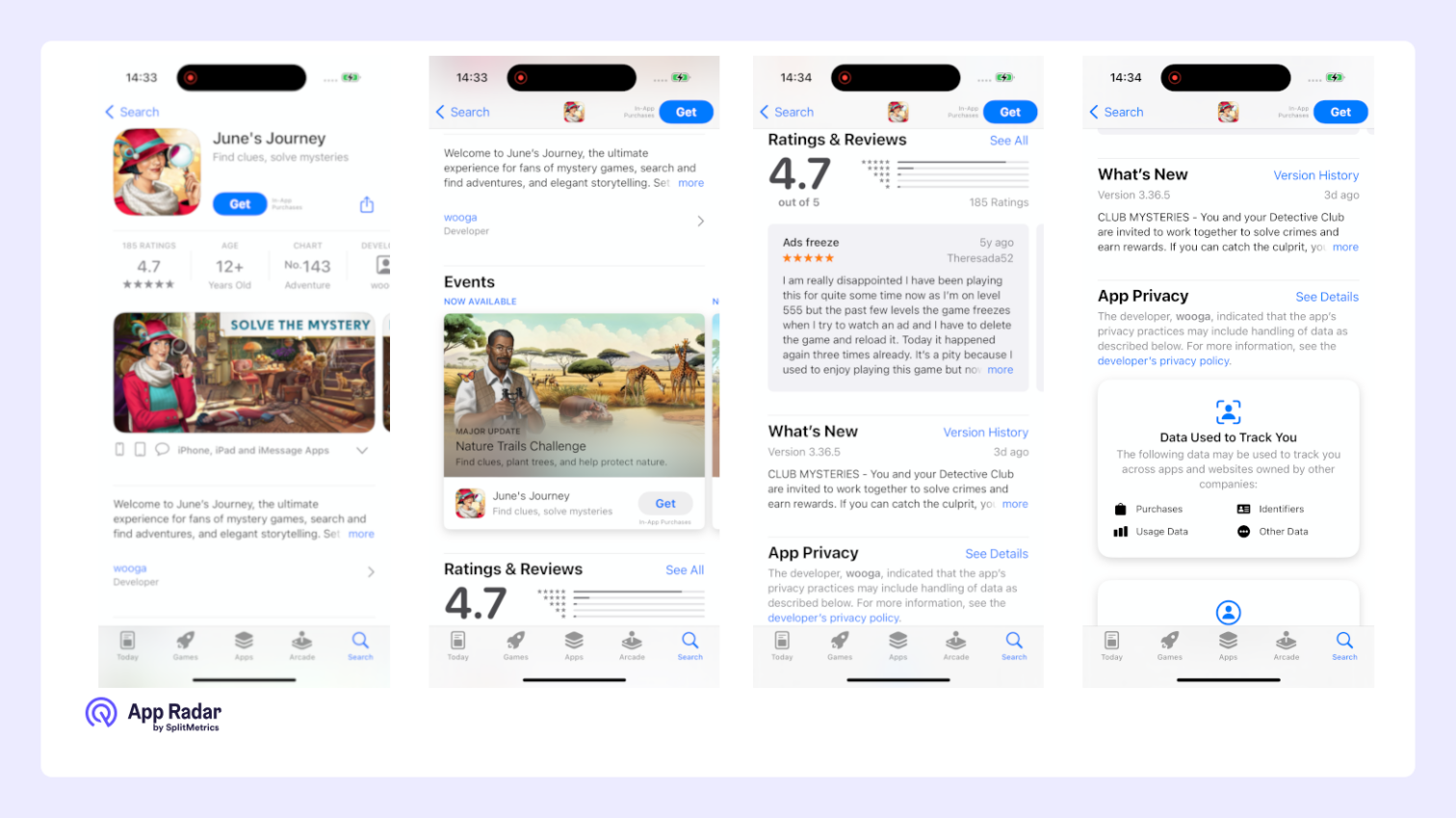
"What’s New" section
“What’s New” summarizes the changes and new features in the latest version so readers can quickly see what’s improved or fixed before deciding to update or install. It is visible to everyone but is especially useful for communicating meaningful updates to existing users.
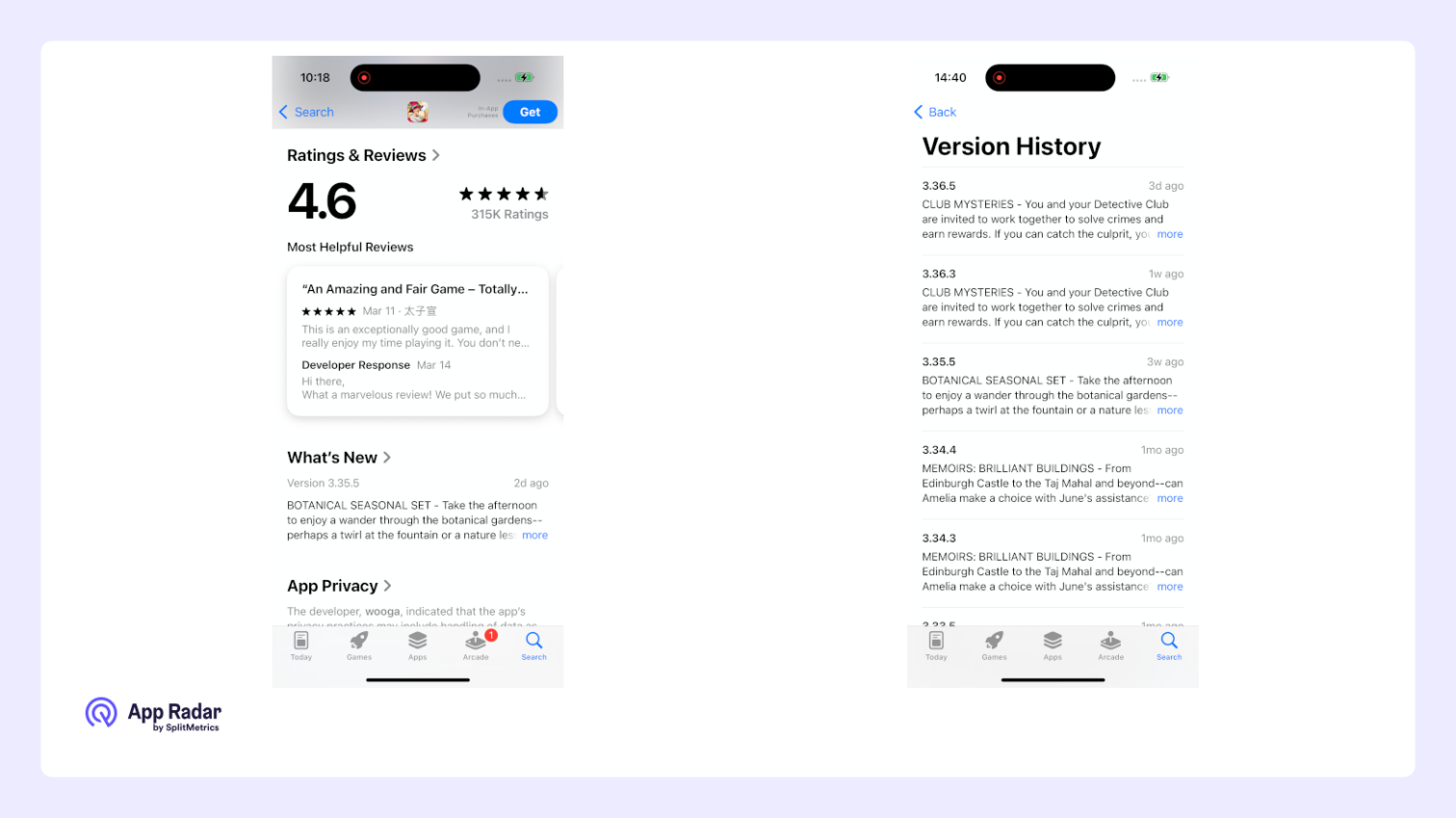
Where does “What’s New” section appear for new users?
For new users, “What’s New” appears further down the page, below the main description, ratings and reviews, and in‑app purchases, so they first evaluate core value and social proof before seeing release notes.
Where does “What’s New” appear for returning users?
For returning users, “What’s New” can appear high on the page — sometimes even above screenshots and app previews — to highlight recent improvements and prompt an update when it’s most relevant.
App ratings and reviews
The ratings and reviews section displays the app’s average star rating and provides review content, helping potential users judge quality quickly and influencing whether they tap into the page or install. The average rating is also shown in search and at the top of the product page next to the icon, name, and subtitle, so it impacts impressions beyond the reviews area itself.

How do ratings and reviews affect ASO?
Ratings and reviews affect ASO because they contribute to visibility and conversion across the store, with higher ratings and steady review volume associated with stronger search performance and better click-through from results. Their influence extends to paid placements as well, where visible star ratings can raise or lower conversion on ad-driven traffic.
What actions improve outcomes?
Maintain systematic two-way communication by responding to reviews promptly, acknowledging issues, and closing the loop after fixes, which can encourage updated ratings and stronger sentiment. Treat reviews as a research channel to spot bugs, UX friction, missing features, and phrasing that should inform the app description, screenshots, and other product page elements.
In‑app purchases (IAPs) on a product page
In‑app purchases (IAPs) can be displayed on the product page when an app offers them and they are selected as promoted in App Store Connect, making them visible as individual items with a name, short description, and image. Promoted IAPs can also appear in App Store search results when their metadata aligns with a query, and may be highlighted in editorial placements such as Today, Games, or Apps, extending reach beyond the default page.

Where are IAPs shown and what is the tap flow?
IAPs are typically shown below the description and What’s New, grouped by purchase type when applicable. If the app isn’t installed, tapping the IAP prompts install and then deep‑links the person into the relevant purchase screen; if it is installed, tapping opens the app directly to the corresponding flow so the user can buy within the experience.
Why promote IAPs?
Promoting IAPs helps communicate value clearly (for example, premium features, content packs, subscriptions) and creates additional indexed surfaces in search, which can lift visibility for high‑intent queries. It also lets the page demonstrate real use cases and price points, improving decision confidence and assisting both organic discovery and paid campaign alignment.
In‑app events in App Store
In‑app events are timely activities developers run inside an app or game – like a competition, premiere, livestream, special challenge, or a new content season – designed to spark discovery and re‑engagement on the App Store for both new and existing users.

Where do in‑app event cards appear?
Event cards appear on the product page, in App Store search (including direct event queries), and in editorial selections across Today, Games, and Apps. The placement on the product page adapts by user status, surfacing above screenshots for existing/lapsed users and below screenshots for new users.
What happens after tapping an event card?
Tapping opens a dedicated Event Details Page with expanded media, a longer description, and participation notes, plus a deep link to route directly to the event context after opening or installing the app. Users can share the page or set a reminder notification for the start time.
Key limits and setup details
- Up to 5 in‑app events can be published on the App Store at the same time per app; additional events can be approved and queued but not published concurrently beyond this limit.
- Up to around 10 approved events per app can be maintained in App Store Connect, with additional constraints preventing new submissions if limits would be exceeded.
- Each event can run as short as 15 minutes and up to 31 days, and can be published on the App Store up to 14 days before the start date to build awareness.
- Events are submitted and reviewed independently of app releases; after approval, dates, regions, and priority can be adjusted before publishing, and start/end dates can be modified while live within Apple’s timing rules.
What is the information panel?
The information panel summarizes key app details so people can quickly understand category, content suitability, technical requirements, and how to get help. It complements the description and visuals by answering practical questions that influence confidence and download decisions.
It includes the following information:
- Category: The primary category the app belongs to.
- Age rating: The app’s content rating that indicates suitability for different audiences.
- Size: The approximate download size to set expectations about storage and data use.
- Languages: The languages supported by the app’s interface.
- Developer website: A link to the developer’s external site for more information.
- Privacy policy: A link to the app’s privacy policy for data practices and compliance.
- App support: Contact information or a link for help and troubleshooting.
- Family Sharing: Whether the app supports Family Sharing, when applicable.
- Game Center: Whether the app integrates with Game Center, when applicable.
- Compatibility: Supported devices and minimum OS versions so people know if it will run.
How does it help ASO?
The information panel helps ASO indirectly by establishing credibility and removing uncertainty that can block installs, especially for privacy‑sensitive users or those with older devices. Clear, complete, and accurate metadata reduces bounce risk and supports the final decision after users review screenshots and other assets.
"More by This Developer" section
This section showcases other apps created by the same developer, encouraging cross-promotion and further engagement with their portfolio.
"You Might Also Like" section
“You Might Also Like” surfaces similar or related apps that people may find relevant, using factors such as category alignment and user behavior to power recommendations. Apple Ads product page ads can also appear here, reaching users who are actively exploring alternatives on the product page.

How does it affect discovery and ads?
This section supports app discovery by giving additional entry points to comparable apps during evaluation, and Apple Ads placements here can lift overall acquisition when targeted to engaged product‑page visitors. SplitMetrics benchmark reports indicate these placements can enhance Apple Ads performance, underscoring the section’s relevance to visibility.
What drives taps in this section?
The same assets that drive first impressions elsewhere—icon, app name, subtitle, and visible rating—are the primary drivers of attention in this section. Clear branding, a readable value cue in the subtitle, and strong average ratings with sufficient volume help win comparisons when users scan multiple options.
Best practices for optimizing app product page
The main goal of optimizing the default App Store product page is to help visitors understand the value quickly and decide to install your app. It matters because the page turns visibility into installs: visual assets drive first impressions and conversion, while text and trust signals clarify value and reduce hesitation.
Treat each element based on its role in discovery and conversion: icon and screenshots for conversion, name and subtitle for rankings and brand perception, and supporting fields for clarity and trust.
- app icon and screenshots for conversion
- app name and subtitle for rankings and brand perception
- supporting fields for clarity and trust.
Leverage all available elements and features that fit the app’s functionality and theme, instead of relying on a single asset, so the full page works together.
A few broad best practices apply to all: be clear and concise, lead with the strongest benefits, keep visuals consistent, and maintain up‑to‑date, accurate information.
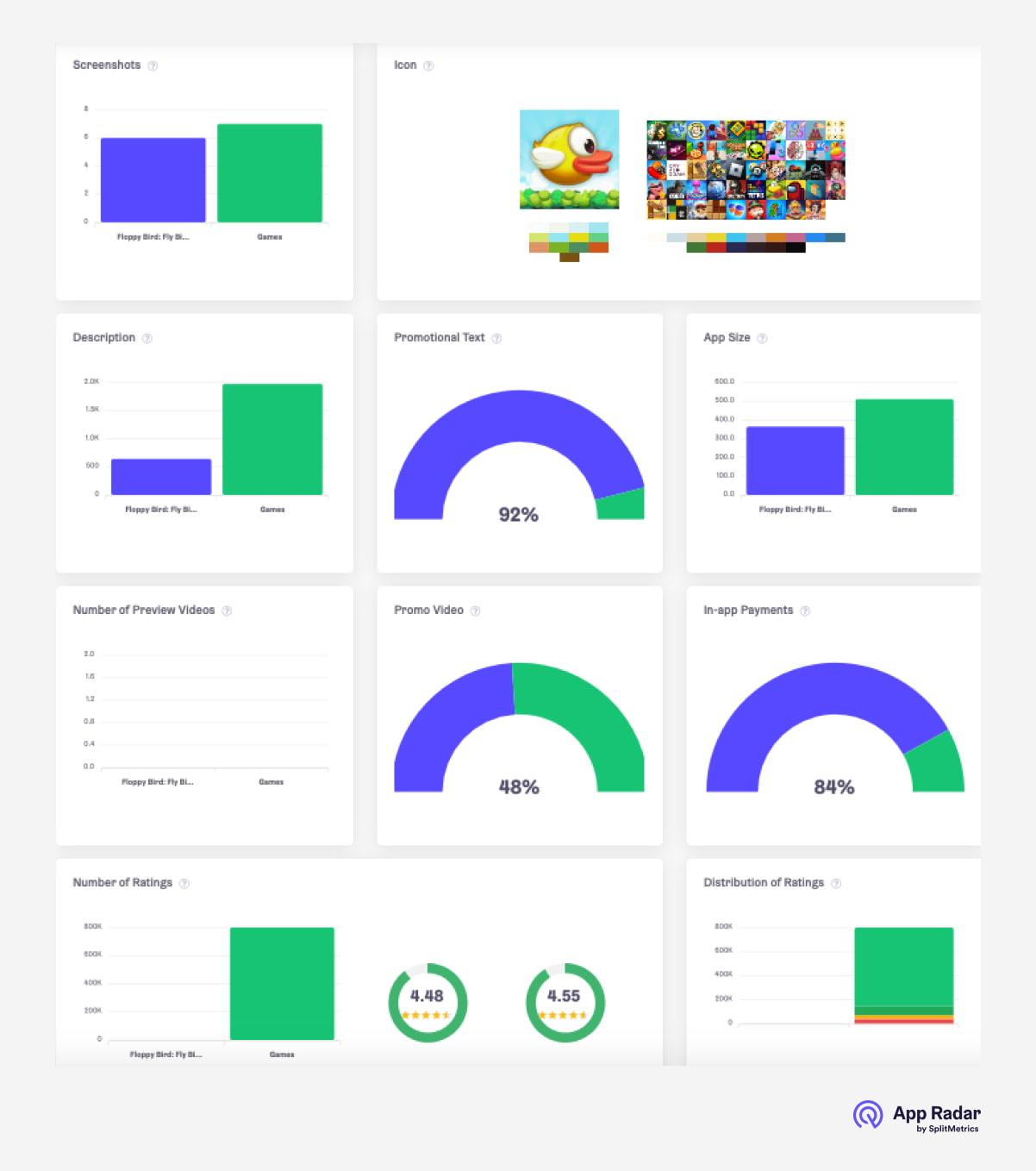
Run competitive & category analysis
Competitive analysis is the foundation of effective ASO and should examine competitors on both the category and individual levels. Focus on design trends, color patterns, and how often and how broadly competitors update their metadata.
App Radar simplifies this work with ASO benchmarks, supporting research at both the category level and the individual app level.
Counter creative fatigue by refreshing your product page
Creative fatigue happens when once‑strong product page assets (screenshots, app previews, icon) lose effectiveness and conversion drops. It often stems from overexposure—visitors repeatedly see the same visuals—and shifting market trends that make older designs feel dated.
Why refresh regularly:
- Ad traffic landing on an unchanged page becomes less responsive over time.
- New entrants and evolving styles can make older visuals underperform.
- Falling tap‑through or conversion is a signal to update sooner rather than later.
What you should focus on:
- Refresh screenshots, previews, and icon to restore attention and relevance.
- Revisit competitive research on a cycle to track design trends and color patterns.
- Use custom product pages to tailor assets to specific keyword themes and discovery mindsets from Today and Search tab ads, helping prevent or fix fatigue while staying within ASO scope.
Keep it simple:
- Short, clear captions.
- Strong first visuals.
- Consistent, current design that reflects the app today.
Pay attention to seasonal updates
Seasonal updates keep the product page fresh by aligning visuals with holidays, cultural events, or seasonal themes, making the app feel timely and exciting. This helps counter creative fatigue and can increase clicks and installs when interest peaks.
What to update:
- Icon, screenshots, and app previews to match key moments (for example, Christmas, Halloween, back‑to‑school, summer travel).
- In‑app events to re‑engage existing users with timely content that connects to the season.
Why this works:
- Seasonal creatives match current mindsets, boost attention, and show the app is actively maintained.
- Time‑sensitive visuals give people a clear reason to act now, supporting conversion in competitive periods.
Localize your product page
Localizing your product page is essential for reaching global audiences by tailoring the name, subtitle, description, and screenshots to local languages and cultures. This makes the app easier to find, easier to understand, and more appealing to people in each market.
Localization lifts visibility in local App Store searches, improves comprehension, and raises conversion rates by aligning with language and cultural nuances. It signals commitment to serving local users, which can increase downloads and positive reviews, turning a single listing into a truly global offering.
Invest in pre-launch A/B testing
Pre-launch A/B testing helps make informed choices about visual assets before wide release. Platforms such as SplitMetrics Optimize support multiple testing methods depending on goals and precision needs.
Because the icon, app previews, and first screenshots heavily influence conversion, test variations of these elements early. Doing so lowers paid UA risk and cost by validating what resonates before investing more traffic.
Engage users, read and analyze reviews
Managing and analyzing App Store reviews is essential for ASO and app success because responding shows that feedback is valued, builds trust, and can improve the average rating, which encourages more downloads.
Analyzing review sentiment and keywords reveals satisfaction levels, pain points, and desired features, which directly informs the product roadmap. This feedback loop enables continuous improvement, targeted fixes, and updates that keep the app competitive and user‑centric.
Final words
Understanding the App Store product page is key to successful ASO because each element contributes to visibility and conversion. From optimizing the app icon and name to crafting clear descriptions and using in‑app events, treating the page holistically leads to stronger results.
To put these strategies into practice and stay competitive, consider using a platform like App Radar for insights and benchmarks. Sign up to unlock more value from the product page and drive additional downloads and engagement
Latest Posts

Academy Lessons

Continue lessons
