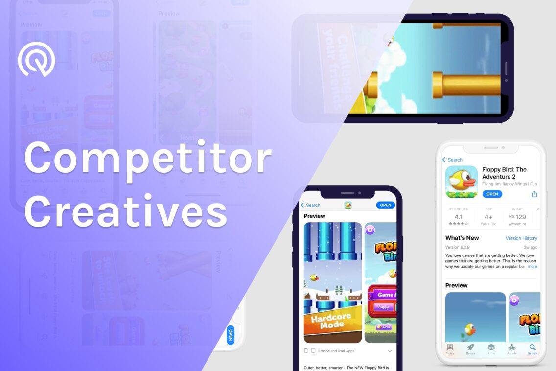
App Store Aesthetic: competitor creatives vs. your app visuals
As an app marketer, you know that app store optimization is a crucial point for a successful app marketing strategy. However, optimizing your app store listing with popular and relevant keywords is not enough in a high competitor app business. App store aesthetics have a high impact on the user's first impression. Therefore, knowing how your competitors visually communicate with your shared target audience is an important part of optimizing your own app creatives. In this article, we will guide you through 2 different ways how to analyze competitors’ creatives.
What is an app store aesthetic?
App store aesthetic is the combination of your app’s visual elements that are designed to increase user first impressions and store views. However, app creatives shouldn’t only be catchy, but also be informative and represent your app brand.
App creatives include 3 main visual elements:
- App icon
- App screenshot
- App preview or promo video

Why are app visuals important?
App store visuals are a key factor for almost 50% of users to decide to either download your app or not. Therefore, optimization of your app store aesthetic is an important part of your ASO strategy. Moreover, the localization of your app store creatives has also to be highly prioritized. You have to keep in mind that some visual elements and colors can have different meanings in different countries. Using the same app store screenshots and previews for different locals is not recommended.
It is also a losing strategy to create an app store icon aesthetic, screenshots and previews once and forever. This process has to be repeatable in terms of optimization. Apple App Store and Google Play Store are updating their policies quite frequently which might negatively influence your app performance. For example, the latest Google Play Policy Updates clearly state that showing popular keywords such as “best, “free”, “top”, “new” same as for CTAs such as “download now” are forbidden now in app store aesthetic. If you are not optimizing your app visuals properly, it might cause you a penalization by the app store.
There are also other important factors like seasonality. The studies show that user behaviour changes depending on the season. For example, Splitmetrics research shows that adding Christmas and seasonal decorations to your app store icon aesthetic can increase your app installs up to 40%. Therefore, adopting your creative assets according to the season should be included in your ASO strategy.

Note: Different seasons require different approaches to adjusting the creative set. Read how to get your app ready for Christmas, Halloween, Black Friday.
Another, and no less important, reason to keep an eye on your app creatives is high competition in app marketplaces. In fact, users are influenced faster by visual communication than written. Therefore, your app store aesthetic has to clearly show your app’s value proposition in a dynamic and attention-grabbing way. Keep in mind that users often compare app store screenshots and previews to validate the potential purchase.
So, as you can see, it is important to constantly optimize your app store icon aesthetic, screenshots and previews. However, another question arises here: how should I optimize my app store creatives? There are different ways you can use app store listing visuals to make a good first impression, we recommend starting with research and analysis. To be more specific, conduct app competitor analysis to identify weak and strong points in their visual communication. More about it below!
How can I analyze competitor app store aesthetics?
App marketers, that have at least once conducted app competitor analysis, know how time-consuming it might be. Moreover, checking competitors’ app store icon aesthetic, screenshots, previews and videos require a lot of effort. In general, there are only two ways you can compare and analyze competitors’ creatives: manually or with the help of an ASO Tool.
Competitor analysis of app store creatives with App Radar ASO Tool
Exploring and analyzing competitor creatives can also be an easy task for app marketers. We at App Radar are happy to help you save your time! Our ASO tool has a new Competitor Creatives feature designed to improve app marketers’ efficiency and provide valuable data for competitor app store aesthetics analysis. Let us guide you through the competitor’s creative analysis with our tool.
After signing up, the first step is to add your app to the App Radar account. Keep in mind that you can select whether you would like to do an analysis on Apple App Store or Google Play Store. Then, decide which competitors you want to analyze. Once you have a list of competitors’ apps, simply add them to your competitor list in Competitor tabs on App Radar dashboard. Moreover, you can also select country/ local to see how your competitors’ apps perform in a specific country.

Curious how easy your competitor analysis can go?
Try out App Radar ASO tool already today
Once you added competitors, you can already see on the overview tab the valuable data for your competitor analysis per country:
- Ranking
- Rating
- Developer name
- Data of last app’s update
You can also dive deeper into store listings of your competitors by checking ‘details’. However, let’s keep the focus on competitor app store aesthetics this time! Once you click on the Creatives tab, you get a clear overview of all the visual components your competitors are using in app stores. Here you can also anytime add or delete competitors.
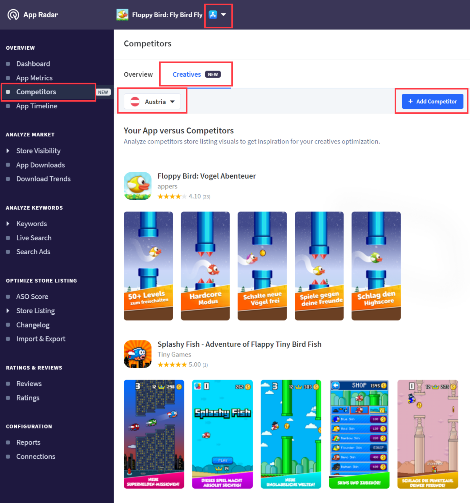
Also, think out of the box, check different locals and compare how your competitors’ apps adjust their app store creatives for different cultures. For each competitor, you can see here:
- app title
- ratings
- developer name
- icon
- visuals, including videos (also optimized for portrait and landscape images)
As your AI competitor research took you only a couple of minutes, now we recommend you identify the best visual elements of your competitors. Keep in mind that you shouldn’tsimply design the same creatives. Therefore, get inspired by the visuals of your competitors and create your own compelling app store aesthetics. Also, remember to localize your app store icons, screenshots, previews and videos.
Eager to know more about how to create attractive app store aesthetics? Then learn more about iOS App Store Optimization and Google Play Store Optimization.
Manual competitor analysis of app store creatives
If you would like to gather data manually to compare app store aesthetics, start with prioritizing your competitors, app stores and locals. We suggest choosing 2-3 competitors, a maximum of 2 app stores, and the most important locals. Otherwise, your app competitor analysis might become your nightmare with overwhelmed manual checks.
As a next step, you will need to create an Excel spreadsheet where you can collect competitors’ app store icon aesthetic, screenshots, previews and your notes. Make the comparison table where you can easily see the difference between your app store aesthetics and your competitors. You will definitely need to use mobile phones that support specific app stores in order to make screenshots of visual elements. Please keep in mind that you will also need to change country/region in phone settings to have access to different locals in app stores.
Once you manually collect all your competitors’ creatives, it is time to identify the best practices. Pay attention to how your competitors visually represent their value proposition and main features. Point out the best examples of your competitors’ app aesthetics and brainstorm how you can adjust these best practices to your visual ASO strategy.
Keep in mind that competitor analysis of creatives needs to be done at least once in a quarter. Evaluate your resources and time wisely if you would like to do it manually.
Summary of competitor app store aesthetic analysis
Now that you know 2 essential approaches to visual competitor analysis, evaluate your time and efforts and start optimizing your app store aesthetic. Remember that visual communication is a strong decision factor for app users.
Also, if your app store screenshots, previews and videos are performing great in one country, it doesn’t mean it will have the same effect on users from different geographical regions. The same applies to users of different app stores. So make sure to localize your app store creatives.
Check out your competitor creatives already today!
Latest Posts

Related Posts

Featured Posts