App Competitor’s analysis of creative assets with App Radar
For every second user, the app store aesthetic is a key factor in whether to download an app. The reason is simple: creatives drive emotions, and emotions drive decisions. To create catchy creatives, app marketers usually start by conducting app visual competitor analysis. As we already described in our previous article, App Store Aesthetic: competitor creatives vs. your app visuals, app competitors analysis might be time-consuming if you don't use a supportive tool such as App Radar.
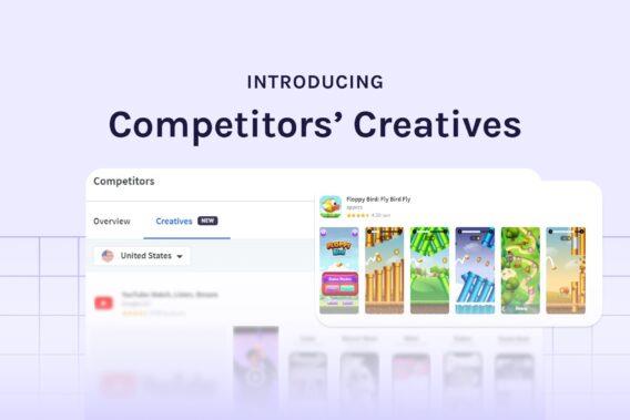
Today, App Radar is glad to introduce a new updated feature for Competitor analysis that will minimize your time and efforts in researching competitors’ visuals. Now you can compare in one tab all the app store aesthetics of your competitors, which includes:
- App icon
- App screenshots
- App preview or promo video (newly added)
- Featuring graphic (newly added)
Let us guide you through the most time-efficient way to analyze app competitors’ visuals.
How do I get information about my app competitors?
As with any other competitor analysis, start by selecting your app competitors. You can differentiate them by direct and indirect competitors:
- Direct competitors will be the ones that offer similar benefits or features. It could also be seen as a direct competition based on metrics that make it comparable.
- Indirect competitors will be apps that are either well-known or bad-known, but you share the features. For example, if your app is super niche and you don’t have that much of direct competitors, you might look for apps with similar features and value propositions.
Once you have a list of your app competitors, add all of them to the App Radar Competitor tab to start analyzing them.

Now you can see a market overview data of your app competitors that include:
- App name
- Developer name
- Ratings
- Rating
- Last update
All this information gives you an overview of your competitors. For instance, a number of ratings can be the first indicator of how big or small a competitor is in a particular country. You can also see who stands behind the app as the developer’s name might be a vast developing agency with many resources.

Remember to change the country to analyze the different markets.
You can get additional information about a specific app by clicking on competitors. Here you can see what the app store listing of a competitor’s app looks like and get additional information about:
- Search Ads Score
- App featuring
- # in Top 100/ 30/ 10 Rankings
- #1 Keyword Rankings
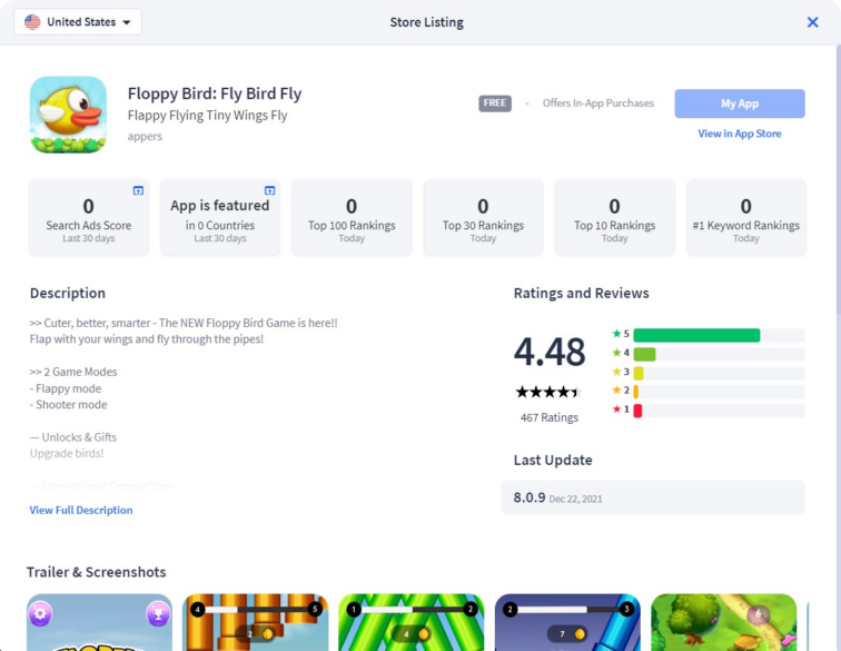
With this information, you can already highlight the strengths and weaknesses of your competitors and define who is leading. Moreover, you can easily switch between locals to see how a competitor performs in each market. Now, let’s dive deeper and see how you can easily compare the creatives of your competitors.
How to compare & analyze apps' creative assets?
Visual elements of apps are as crucial as keyword optimization. App creative assets play the final decision role for potential users. To optimize your listing visuals, you need to know what design elements competitors’ apps use and what performs better.
App Radar has launched the Competitor’s Creative feature to save your time with manual browsing from one app to another. With this updated feature, you just need to click on the ‘Creatives’ tab under the Competitors, and you can get inspiration for your creative’s optimization.
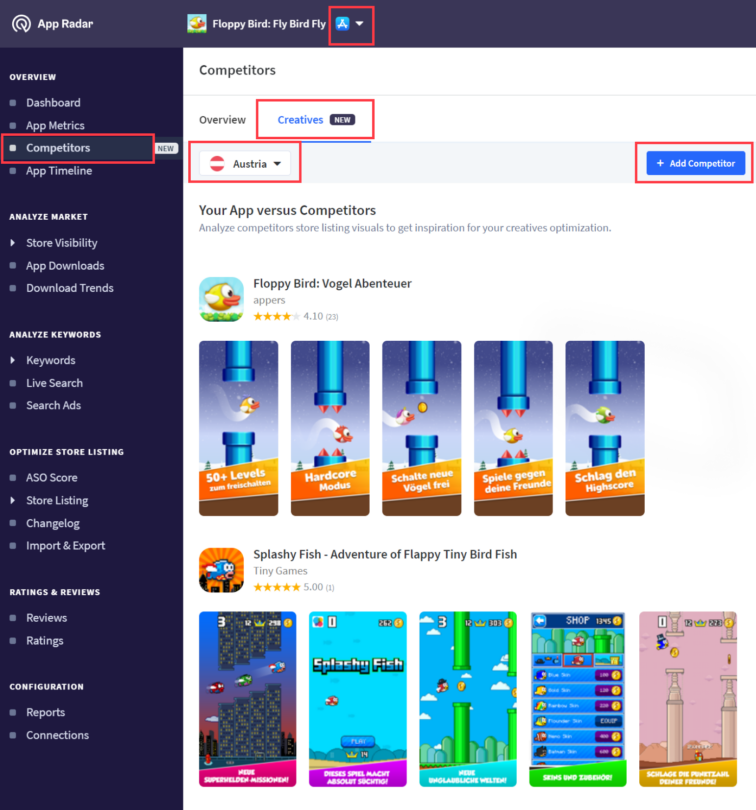
Keep in mind that you can always remove or add more competitors during your analyses.
As you can see, the dashboard provides an overview of all creative assets from competitors’ apps. An additional window will pop up by clicking on the video to watch the app preview or promo video. You can also easily save the app screenshots of your competitors to your device by clicking on the image and then ‘save image as.’
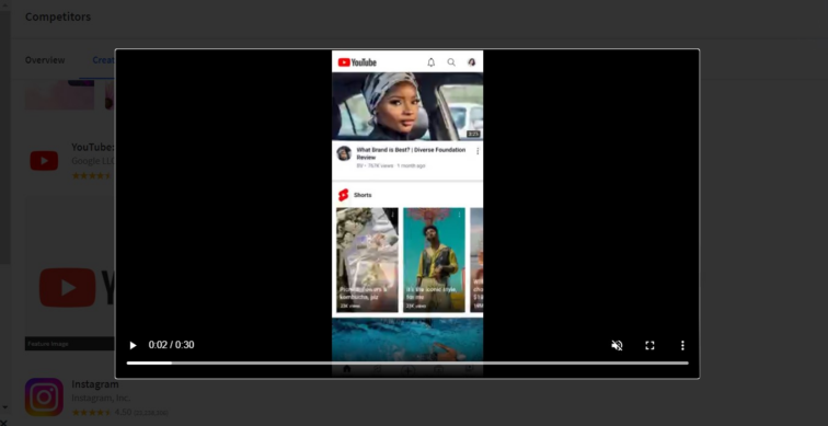
As you save your time in researching phase, now you can take your time and carefully compare all visual elements of the app store aesthetic. While analyzing creatives, pay attention to:
- Representing the brand in creative assets
- Showcasing in-app experience
- Color schema
- Design elements
- Storytelling on screenshots and videos
- Messaging on creative assets
- Personalization in app store aesthetic
Remember to respect Google Play Store and Apple Store guidelines.
Compare apps’ visual elements according to these criteria and highlight the most winning combinations. Don’t forget to check creatives in different locals. We strongly recommend paying attention to how your app competitors localize their app store aesthetic across different countries. Identifying their vital messages and positioning in different markets is crucial. App Radar’s competitor’s creative feature allows you to do it quickly and efficiently.
What to look for within app competitor videos and feature graphics
Another essential criterion of app competitor analysis is the video duration in the app store listing. Try to identify the average duration of your competitors’ app previews/ promo videos. As Apple Store has a limitation of 30 seconds maximum, we also recommend not using longer videos for Google Play Store. Although the video is not mandatory to use in app store listing, it is an opportunity to catch the users’ attention by showcasing in app experience.
As in the App Radar dashboard, you can see feature graphics for Apple Store and Google Play Store. Here is some vital information that you need to know about feature graphics:
- Initially, you don’t need to provide to Apple Store a feature graphic. Only when your app is getting featured on Apple Store, they will contact you to provide the so-called “promotional artwork”.
- Conversely, on Google Play it is mandatory to upload feature graphics.
- Google Play feature graphic can be used as an overlay of video for Google Ads.
App Radar’s alert can also notify you when your app will be featured. Check your competitors’ graphics, get inspired and prepare your outstanding featuring graphic.
The final words
As you can see, competitor app analysis of creative assets has never been so easy! It requires only a list of your app competitors and a couple of clicks. Our AI-powered system will collect the essential market information and provide you with all the visual components of your competitor’s store listing. After that, you need to go through the visual assets and analyze what and why they perform well. The findings you get during the competitor analysis could be transformed into learnings and adjusted to your app.
Curious how easy your competitor analysis can go?
Use App Radar’s Competitor Creatives feature to get inspired and create outstanding app store aesthetic!
Latest Posts
