iOS app icon sizes and best practices (2024 update)
iOS app icons are the visual identity of mobile applications in Apple's App Store. They are the first thing that users see and interact with in the App Store and on their device screens. An app icon is more than just a graphic - it represents your mobile app or game. In a marketplace crowded with millions of apps, app icons impact recognition, draw users' attention and encourage them to explore further.

In this article we’ll share with you iOS app icon size requirements, discuss the importance of app icons, share tips and know-how on their design, and a bonus list of app icon makers and design tools.
Let’s jump in.
Why are App Icons Important?
App icons enhance visibility, support branding efforts, influence user perception and drive downloads. A well-designed app icon helps the app stand out in search results and category listings, making it more likely to be noticed and downloaded by users.
First impressions matter; the icon is often the first point of contact between an app and its potential users. The result of a well designed icon is high user engagement and positive app perception. In other words – wee designed app icon can have a big impact on app conversion rate and app store optimization (ASO).
A professionally designed icon suggests a high-quality app. In contrast, a poorly designed icon may deter users from downloading the app, regardless of its actual functionality or quality.
What is the Role of App Icons in Apple’s App Store?
In the Apple’s iOS ecosystem, app icons play a decisive role in the app discovery process. The icons help users quickly identify and select apps from a sea of different options.
An attractive and intriguing icon entices users to click through to the app’s page on the App Store. From there, users check out reviews, descriptions, and screenshots.
If users like what they see – they download the app.
What are iOS App Icon Sizes and Specifications?
Here are the app icon size specs for Apple devices.
iPhone and iPod touch:
- App Icon (iOS 7 and later): 1024px x 1024px (PNG or JPEG)
- App Icon for Spotlight Search (iOS 7 and later): 120px x 120px (PNG)
- App Icon for Settings (iOS 7 and later): 87px x 87px (PNG)
- App Icon for Notification Center (iOS 7 and later): 40px x 40px (PNG)
iPad and iPad Pro:
- App Icon (iOS 7 and later): 1024px x 1024px (PNG or JPEG)
- App Icon for Spotlight Search (iOS 7 and later): 120px x 120px (PNG)
- App Icon for Settings (iOS 7 and later): 87px x 87px (PNG)
- App Icon for Notification Center (iOS 7 and later): 40px x 40px (PNG)
Apple Watch:
- App Icon for Home Screen: 172px x 172px (PNG)
- App Icon for Short-Look Notification: 86px x 86px (PNG)
- App Icon for Long-Look Notification: 48px x 48px (PNG)
Mac:
- App Icon for macOS: 1024px x 1024px (PNG or ICNS)
For an app icon to be effective, it must meet Apple’s technical specifications for size and format.

These requirements ensure the icon looks sharp and clear on all screen sizes and resolutions, from the smallest iPhone SE to the largest iPad Pro.
And in case you didn’t know, Apple requires developers to submit icons of various sizes for different devices and contexts, such as the App Store, home screen, settings, notifications, and Spotlight search.
How to Make Your App Icon Stand Out?
Creating a distinctive app icon requires a combination of creativity, branding insight, and basic design principles.
Here are the five golden rules of stand-out app icon design:
Embrace Simplicity and Clarity
A simple icon design ensures the icon is recognizable even at the smallest size. Avoid clutter and focus on a single element that captures the essence of your app.

Magisto app is a great example of simple and effective app icon
Pay Attention to the Use of Color
Color is a powerful tool in making an icon pop. Choose colors that align with your brand and contrast well against the App Store background and other apps.

BeeSpeaker app uses only two colors that help the icon stand out
Include Unique Shapes or Symbols
For example, when designing a logo, incorporate a unique shape or symbol that can become synonymous with your app. This shorthand visual can make your app instantly recognizable.

Expedia is doing a great job with a combination of an arrow and rectangle
Stay Consistent with the App's UX Design
Ensure that the icon reflects the design and color scheme of the app itself. This consistency reinforces your app’s brand and improves user experience.

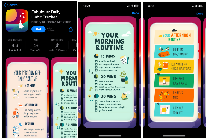
Fabulous app uses same colors for app icon and other app creatives
Test, Iterate, and Test Again
Design several icon options and test them with your target audience. Use feedback to refine your design until you find the most effective icon.
Tips for Creating the Best iOS Icon for Your App or Game
Creating the perfect icon for your app or game requires a strategic approach considering the icon’s impact on user engagement and brand perception.
The goal is to capture the essence of your app or game and enhance its marketability and success in the App Store.
We’ve pulled out a list of best practices for designing app icons that look great and perform well in the App Store.
Make the Icon Clear & Simple
A clear and simple design ensures that your icon is easily recognizable and memorable by users browsing the app marketplace. Focus on a single element that represents your app or game effectively, avoiding clutter that can dilute the icon’s impact.
Stick to Your Brand Visual Guidelines
Your app icon should follow the same guidelines and convey your brand image. Include the color schemes, typography, and overall brand style. Consistency with your brand helps to build recognition and trust with users.
The key takeaway is that at first sight, the user should know it is yours and recognize your brand in the app icon design.
Don't Necessarily Use the Logo
While using your logo in the icon can work for well-established brands, there are better approaches for all apps. Sometimes, a more abstract or illustrative design can better convey the app’s purpose and appeal to users.
Add Borders in the Icon
Adding a subtle border can help your icon stand out against different backgrounds and ensure it remains visible on any device screen.
Think About the Background
Since users can choose between a clear and a dark background, you need to make sure that the icon stands out on every background.
Choose a background color or design that complements the icon’s main element and enhances its visibility and attractiveness. A very dark icon could go unnoticed on a dark background, so you could go for bright colors adapted to both backgrounds.
Avoid overly busy or detailed backgrounds that can make the icon look cluttered.
Check on the Colors Used for the App Niche
Research the common color schemes used in your app’s industry or niche. While it’s important to stand out, you also want to ensure that your icon’s colors align with user expectations for your type of app.
Go for the ones that best represent the essence and functions of your app.

Examining top charts of an app’s category is a great way to research the market
A/B Test the App Icon Design
This tip is a must for every ASO strategy. A/B testing allows you to compare different icon designs to see which performs better in user engagement and downloads.
Use the insights gained from testing to make data-driven decisions when refining your icon.
Work with Seasonality
Consider updating your icon to reflect seasonal events or holidays. This can make your app feel more dynamic and engaged with current events.
Differentiate Your App Icon from the Competitors
Analyze your competitors’ icons and look for ways to differentiate your icon design. Try to use a different color scheme, design style, or visual element that sets your app apart.
Make the App Icon Scalable
Ensure your icon looks good at all required sizes, from the smallest icon on the device screen to the largest display in the App Store.
Don't Overload the App Icon
Avoid cramming too much detail into your icon. A simpler design is often more effective and easier for users to recognize and remember.

Hopper is another example of a simple and effective app icon
Make the Icon Recognizable
Aim for a design that users can easily associate with your app’s function or content. A recognizable icon can significantly improve your app’s visibility and appeal.

Almost anyone can recognize WhatsApp icon at the first sight
Update the Icon Regularly
Regular updates to your icon can keep your app looking fresh and relevant. Consider making minor adjustments or seasonal updates to maintain user interest.
Avoid Transparency
Transparent in-app icons can cause visibility issues against different backgrounds. Make sure that your icon has a solid, opaque background that maintains its integrity on any screen.
What is the Easiest Way to Create and Generate App Icon?
Not everyone has the skills or resources to design an icon from scratch. Fortunately, several app icon makers and generators are available that can help streamline the process.
These tools offer a range of templates, design elements, and customization options to create professional-looking icons without the need for advanced graphic design skills.
App icon makers are making it easier for developers to create eye-catching icons that can attract users and enhance the overall appeal of their apps.
Here’s a short list of popular app icon-maker tools you should check out:
Canva
Canva is a user-friendly graphic design tool that offers a variety of templates for app icons. It allows easy customization of colors, fonts, and images to create an icon that aligns with your app’s branding.
Adobe Spark
Adobe Spark provides a simple interface for designing app icons. It features a selection of pre-designed templates and design elements and allows users to upload images for a more personalized touch.
Iconion
Iconion is a dedicated app icon maker offering various icon styles and customization options. Users can select from various shapes, backgrounds, and effects to create a unique icon for their app.
AppIconMaker.co
AppIconMaker allows developers to generate app icons of all required sizes for iOS and Android platforms. It supports drag-and-drop functionality for easy uploading and customization of images.
MakeAppIcon
MakeAppIcon simplifies the process of creating app icons by automatically resizing uploaded images to meet the specifications of different platforms. It also previews how the icon will look on various devices.
Key Things to Remember About iOS App Icon
The app icon is a key component of your app’s presence on the iOS platform. It serves as the first point of interaction with potential users. It plays a significant role in the app’s branding, perception, and download rates.
Follow the best practices for app icon design and leverage the right tools to create icons that stand out in the crowded App Store and drive more downloads.
Remember, a great app icon is not just about aesthetics; it’s about making a strong first impression, conveying your app’s essence, and enticing users to engage with your content.
Latest Posts

How Watch Duty Became the #1 Wildfire Tracking App on the App Store
Check Out App Radar’s Expanded Rankings & Improved Keyword Data Quality!
Unlock App Performance Data with App Radar's API
Try Our Redesigned, AI-Driven Keyword Research & Monitoring Tools for Faster and Easier Workflows!
Academy Lessons
Continue lessons

