How to Design App Icons for Your Game
This is a guest post from Valeria Santalla, a content creator at Envato, dedicated to creating helpful content pieces for small business owners to market their brands. She currently collaborates at Placeit, one of the largest logo makers and design template libraries on the internet.
We live in a world of first impressions and this is why if you are serious about launching your gaming app, creating a stunning app icon should be a priority. You want to design something that is recognizable, representative, and eye-catching!
One scroll through the app stores, and you’ll see there are millions of games to compete with. And you need to stop users from scrolling past your app with an awesome icon design!
Ready? Let’s start designing some top gaming app icons!
What is a Game App Icon?
Game icons are those small images users click on to get into your gaming app on their mobile devices. They are a sneak peek into what your game is all about.
“Your icon is the first opportunity to communicate, at a glance, your app’s purpose.” Apple
You should know a game app icon is not the same as your game logo. They both will share branding qualities but they are not the same. These are two different pieces of graphic design that are part of your whole brand. Game icons serve the purpose of app stores only while a logo globally represents your game everywhere.
How Do You Design a Game App Icon?
Your app icon should really stand out and represent your brand. So it is important that you design an attractive icon from the start.
One rookie mistake is using the actual name of your game on the icon. Game developers fear the user won’t recognize their game and choose to use their lettered name. This won’t happen if you have branded your game correctly. Would you confuse swoosh simply because it doesn’t say “Nike” on it?
There are a few design principles you should always keep in mind when creating a proper game app icon.
Scalability
Remember, an app icon is a relatively small icon. So going back to design principles, your design should look great on large-scale images as well as on small.
For example, let’s say you use your main character as your icon. If your character isn’t recognizable at a small scale, you could only use its face.
Simple & Clean
In general, try to avoid overwhelming your potential users. To create something that is attractive and inviting, follow the design principle of cleanliness. In this particular case, less is actually more. Try to use only one symbol and provide a single focus point that is highly representative of your game.
Recognizable
It’s also important to make your app icon clearly recognizable. Avoid creating a situation where your users need to figure out what your icon and app are about. So design an icon that is connected directly to your game and brand.
Contrasting Shades
High contrasting colors will make your game icon pop out in the app stores. Use these colors between the icon and the background.
Stand Out from Your Competition
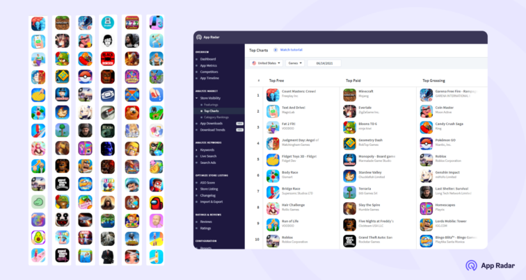
Researching your competition is an important practice, no matter if you’re after organic or paid installs. Analyze other peer developers so that you can create a different offer. This might sound like a no-brainer but if all your competitors are using warrior characters on their game icon – then think of a different approach! This will help you stand out from the rest.
Dive Deeper:
Sizes for iOS App Icons
Design requirements for Google Play App Icons
Choose a Tool for making your App Icon
You can, of course, design your own game app icon using a specialized design software like Photoshop. But you can also use an online creator tool like Placeit to create gaming app icons. A great thing about online tools is that you can find free video game icons that won’t cost a thing. Another option is to hire a freelance designer to help you out with your game icon design.
Pick a Style
Whether you choose to work with a designer or use online logo makers, you will have to decide on an icon style that fits your whole game branding. There are Arcade icon styles, boardgame, card games, musical games, sports games, role-playing games, retro, minimalistic, and much more to choose from.
Compare iOS app icons vs Android icons
Consider the main difference between iOS app icons and Android when creating your design. iOS doesn’t support transparent backgrounds and icons must be square-shaped or else it will fill with black all the empty space. This could really mess up your design! To avoid trouble altogether you can use a solid squared background for your icon design on both Android and iOS apps.
Do A/B testing for your icon variations
Use Google app developer console to A/B test different icon variations and see which one performs better. This will give you a pretty good idea of which design is more attractive to users.
Summary of designing app icons for your game
Go from basic to fantastic in order to get users to download your game. A cool game app icon can really help your game become more popular than your competition! Choose a tool that is the best fit for you to create your app icon design. Follow a few of the design principles so that you get an icon that is representative, attractive and clear!
Latest Posts
Related Posts
How to promote your mobile game and increase Google Play and App Store downloads
How to localize mobile games with ChatGPT: 20 prompts you need to try out
Step by Step Guide: How to create a successful mobile app gaming studio
Growing a Game App: Data-Based Tips Beyond User Acquisition
Featured Posts
