10 App Launch Email Examples and Why They Worked
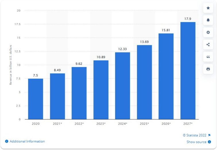
Email marketing is a powerful instrument in your mobile app growth toolbox. Despite all the rumors about the inefficiency of email marketing, statistics and some brands have the opposite opinion. Email marketing revenue is confidently growing year by year.
This article will focus on the main aspects of app launch emails, including the best practices for writing app announcement emails and showing successful examples from well-known brands.
Let’s start with some exciting data.
Why should you include a mobile app launch email in your app promotion strategy?
A mobile app launch email is an excellent way to create the much-needed buzz that will help your product reach a broad audience along with other marketing strategies. As mentioned before, email marketing revenue has grown during the last year. Moreover, according to Statista, the email marketing revenue worldwide is expected to reach 17.9 billion U.S. dollars in 2027. In other words, this number proves the efficiency of email marketing efforts.
On another important note, product launch emails for software and web app have quite an impressive open rates, according to the graph below:

Undoubtedly, it would be best if you still put effort into making your app launch email attractive and convertible. According to HubSpot Blog Research, the most effective strategies for email marketing campaigns are
- subscriber segmentation (78%),
- message personalization (72%),
- email automation campaigns (71%)
So, as you are convinced now to try email marketing for your app promotion, let’s dive deeper into the app launch emails.
Types of mobile app launch emails
An app launch email is not only aimed to create a buzz about newly launched apps. In general, a launch email focuses on getting attention from people about something new that happened or is about to occur within your product. Here are the most common types of app launch emails:
- Product release emails aim to inform your customers about a new product launch.
- Pre-order emails inform your customers about a unique opportunity to try the product first and create an exciting moment.
- Upcoming feature announcement emails inform your customer about new features or functionality in your product.
- Future sales emails promote discounts or special prices for a new product release.
- An event invitation email usually promotes a launch-related event, like a webinar.
Depending on your app growth strategy, you can choose an email type to promote a specific action related to your app launch. However, one of the most successful ways to inform your customers about the upcoming releases is to create a sequence of emails:
- A teaser email that will build anticipation
- Announcement email that ends the suspense
- Product release email, in other words, app launch email
Remember that customers usually don’t like to be spammed with emails. Therefore, ensure that you start with your email marketing early enough to have some time between a sequence of emails.
How to design convertible mobile app launch email
Designing a successful mobile app announcement email isn’t easy, as you should balance your app branding guidelines and crazy creativity. By analyzing the successful launch emails, we can now highlight the crucial elements of app launch emails in the conversion rate.
- Stand out with your email design – the graphic is the most important way of communication and creating excitement. Therefore, make sure you use strong visual language in your announcement email as it should grab customers’ attention. Later in this article, we will show examples of standout email designs.
- Align email graphic with your branding – use your brand colors, fonts, and logo in your email to make it easy for potential customers to recognize your brand.
- Grab attention with a subject line – header is a vital factor in email opening rate. Therefore, keep it short and catchy. Ideally, your subject line should be about 50 characters. Depending on your brand tone, you can also use emojis as it helps your email to stand out.
- Personalize your emails – either you mention the name of your customers or just joke in the email, your main goal is to be as closer to your customers as possible. People appreciate the personal touch in emails as it makes them feel that they are receiving an email from a friend. No need to say that personalized emails convert better.
- Test different CTAs – A/B testing is a must-do for your announcement emails. You can try different CTAs in your launch emails to find the winning version, which you can use in the following sequence of emails.
10 examples of successful app launch emails and why they worked
Now let’s apply all the above theories to the practice. Here are 10 successful app launch email examples and our analysis of why they worked.
1. New feature announcement by Grammarly
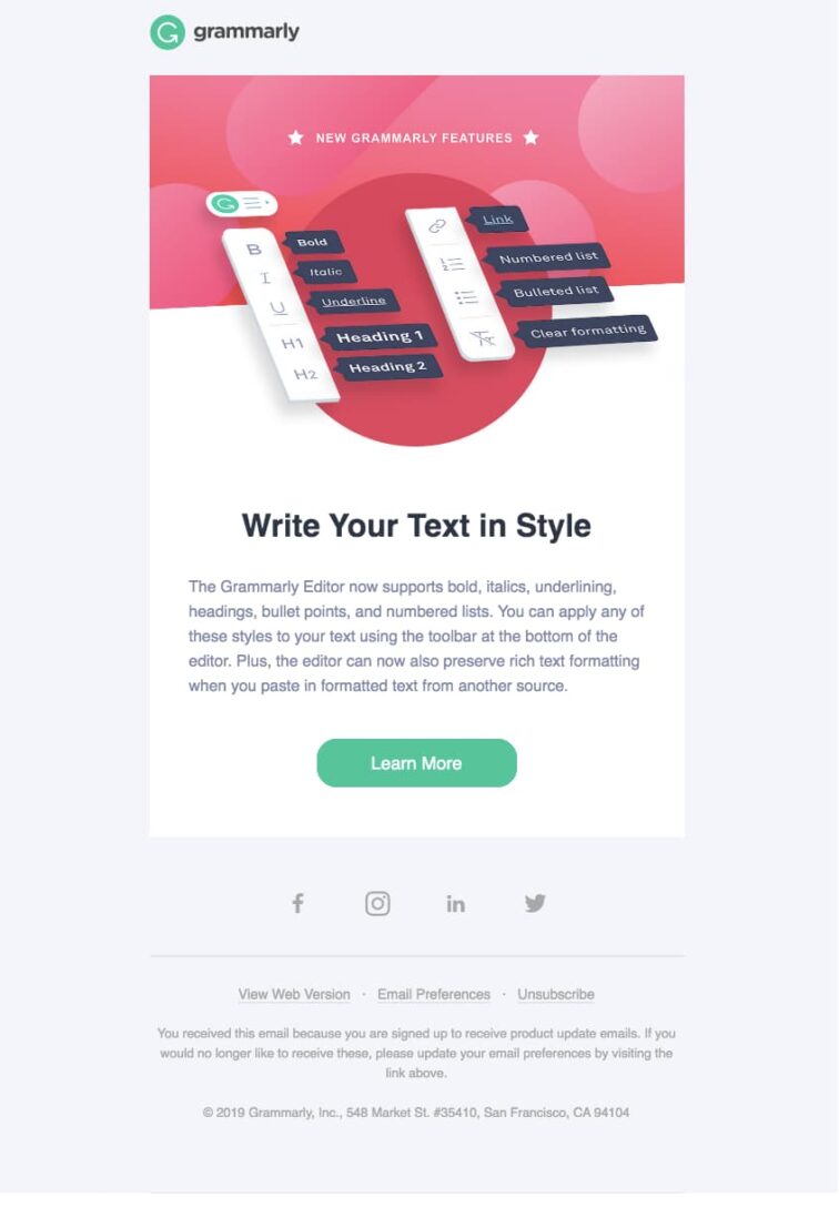
Grammarly is a well-known writing tool based on AI-powered technologies. The tool is available for a variety of devices and operational systems. It’s a fast-developing company that launches new app releases quite often and communicates it through email marketing in an excellent way.
Why did this work?
This launch email is an excellent example of presenting information shortly and effectively. The graphic clearly shows the app’s new feature and is executed in Grammarly branding style. At the same time, the body text is concise and concrete, which makes it easier for customers to read. The subject line in this email is ‘Rich Text Formatting Has Arrived!’. It’s intriguing and anticipating.
2. Gemini Photos: Gallery Cleaner for iOS
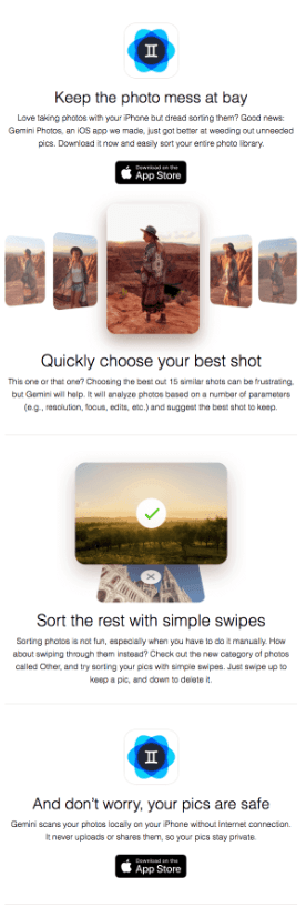
Gemini photos is an app that uses machine learning to identify, sort and clean your Apple device’s photo library by grouping photos together and identifying which of the similar ones is the best photo, considering parameters like resolution or edits.
Why did this work?
Even though this app is an official app created by an external provider for iOS, the email follows Apple’s brand voice: it’s minimal, classy, and without a hint of complication. Moreover, it’s very clear and precise, showcasing what the app is about while clearly showing the value from the beginning by stating: “Keep the photo mess at bay.”
It is a compelling CTA, clear, simple, and enticing at the same time – who doesn’t want to find what they need with minimal effort? Who likes mess and clutter? The answer is nobody and no Apple user, as Apple is all about simplicity, minimalism, and one-tap results.
The subject line is “Is your iPhone drowning in photos? 📲”. Like the CTA, the subject line is enticing enough, as it implements both contemporary elements – look at the phone emoji! – and phrasing that pretty much answers the “Why do I need this” question, enticing the user to open it.
3. Venmo: financial app
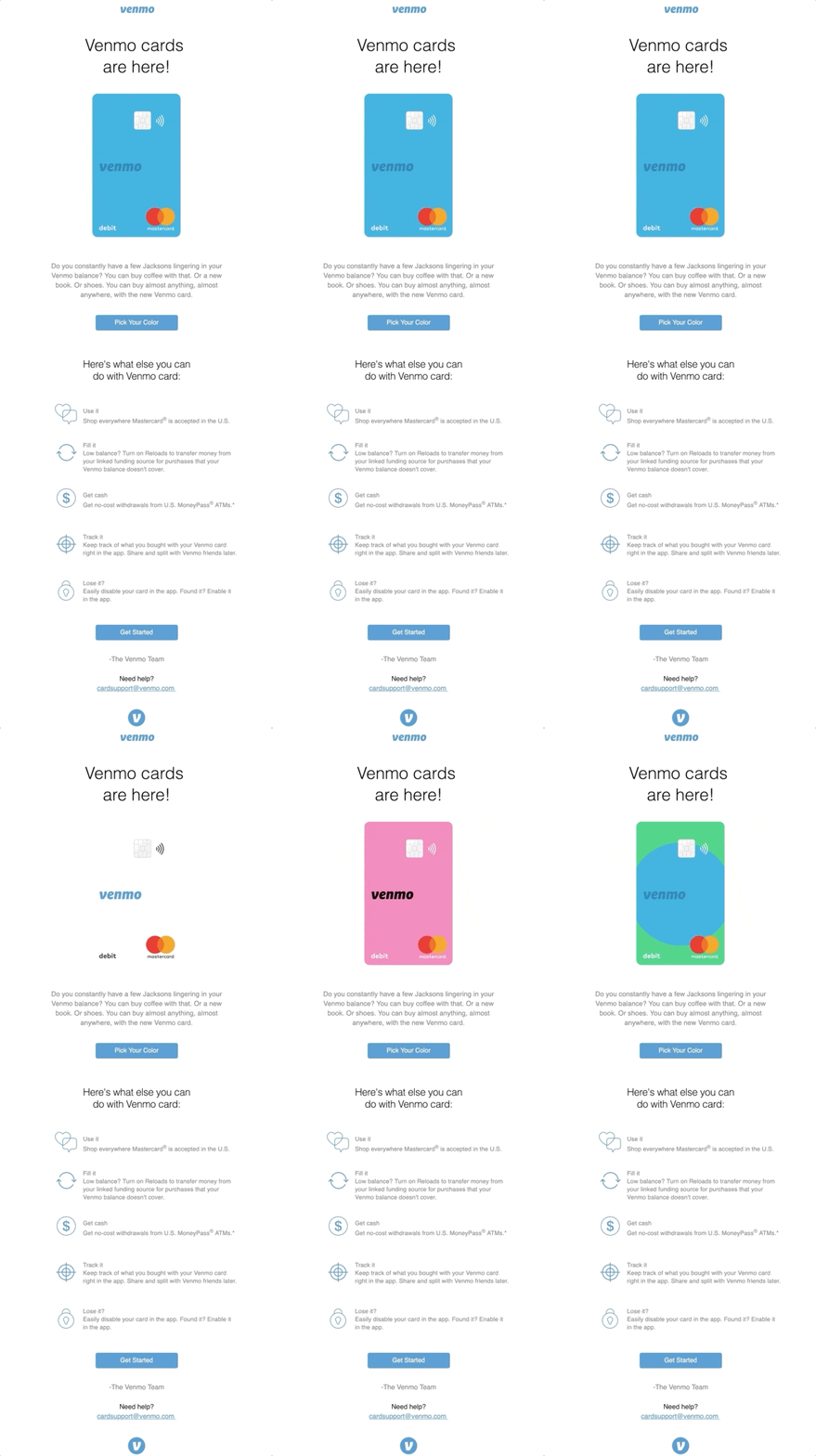
Venmo is an app for fast, safe, social payments between friends. The overall design and branding of the company focus on creating a relaxed and friendly atmosphere even though it is all about money transactions.
Why did this work?
First, Venmo uses an amazing animated graphic that presents a new product launch. From the first moment, the customer’s attention is grabbed by the colorful graphic and explicit header: Venmo cards are here! This launch email also has a clear structure. So for those customers who prefer to scam through emails, it will not be a problem to identify the most critical moments with icons and paragraphs.
4. Collect: Save and share ideas
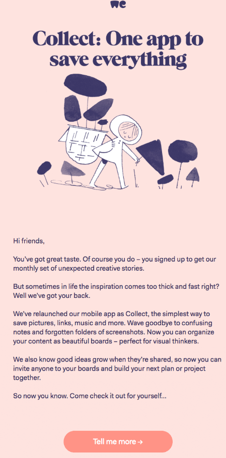
It’s more of a relaunch than an original launch itself, but Collect, WeTransfer’s app, enables users to save everything in one place, from photos to videos, audios, notes, and anything that can be combined to create great visual content.
Why did this work?
We’re looking at content that is consistent with the brand’s tone of voice. The colors, the friendly tone, everything is what it should be like. And WeTransfer’s email takes it a wee bit further by pampering the subscriber: “You’ve got great taste.” A little compliment goes a long way, and these guys seem to know it well.
And what about the punchline? “One app to save everything.” It makes users think they won’t need any more apps. It’ll save them the time and energy of looking through their phone-not to mention eliminating the feeling of frustration that comes with searching for just the right thing through this and that app!
On the subject line: “Welcome to Collect by WeTransfer.” Coupled with the “You signed up to get our monthly set of unexpected creative stories”, this subject line builds on the story-telling aspect the app is all about.
5. CraftCellr (Oznr)
CraftCellr (now renamed to Oznr) is a mobile app for beer lovers. In other words, the online craft beverage marketplace allows the whale hunters of the world to connect directly with the brands they love.

Why did this work?
It is an excellent example of a personalized email. Right from the beginning, you feel that you are part of this community, and the team of CraftCellr thanks you for being so patient and waiting for the Android app launch. They’re also highlighting different features of the app and supporting it with screenshots. Pay attention to how they end an email. Not all companies are brave enough to admit that their launch might not be perfect. But CraftCellr talks with customers as with good friends, which makes customers also feel the brand’s trust.
6. MasterClass: Learn New Skills
MasterClass: Learn New Skills app was developed to complement an online education platform that offers classes to its subscribers – at a price, of course. These classes are on any subject you could want and are taught by the world’s most famous creative minds, from Gordon Ramsey to Neil Gaiman.
So, see what they did with the name there? Their classes are taught by the Masters of each trade – talk about consistency.

Why did this work?
More on that consistency: Masters don’t need introductions or suggestions. The CTAs reflect that: “Get”, “Discover”, “Access”.
And of course, this is the tone set by the email from the beginning: “Explore the MasterClass app.” It is evident that this is a serious platform for serious professionals that really want to learn and learn from the best. The colors reflect the website’s colors. It’s very hard not to understand what they’re all about, just by looking at it.
7. Starbucks
Starbucks is a well-known coffee company around the world. With this launch email, they announced the updating Starbucks app for iOS.

Why did this work?
Besides the transparent header and CTA, Starbucks highlights new app features and encourages customers to try them out. App screenshots make it attractive and explainable what the features look like. The supportive text highlights the benefits of using an updated app.
8. Skillpages
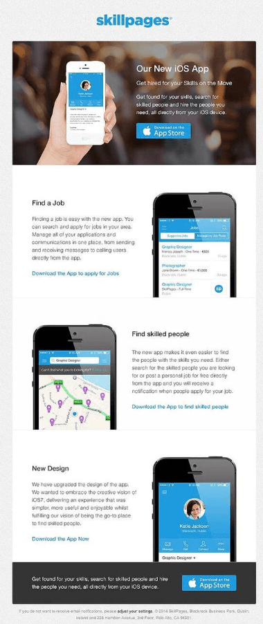
Skillpages, much like MasterClass, began as a platform. This one specializes in finding skilled professionals worldwide and includes more than 160 countries.
Why did this work?
It gets straight to the point without being strict about it. The email design is pleasant, and the images reflect exactly what the app is meant to do.
The CTAs are practical and reflect the app’s true nature: “Get hired for your skills on the move.” The phrasing showcases why a professional should download the app.
On the subject line: “Check out our new app and get found for your skills.” Straight and to the point. The subscribers are professionals, busy, and need to know the hows and whys right up front. This subject line does it precisely without being too obvious – the user still needs to open the email and see the new app and how it can help with the user’s job hunt.
9. Asana teaser email
Asana is task managing software that helps teams to work more collaboratively and in a more efficient way.
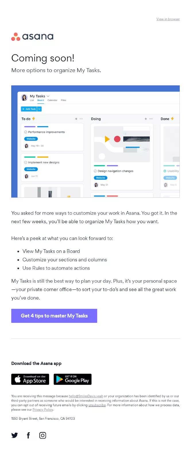
Why did this work?
This teaser email was sent to all Asana’s subscribers and customers to inform them about the upcoming feature release. The wording is quite intriguing and, at the same time, creates some expectations. Although it is not yet a release email, Asana has given some visual hints on what users should expect soon.
You don’t see any CTA related to the new feature launch in this email. However, the company refers to the blog where users can still get some tips on how to use an app.
10. Nike
No introduction is needed. Nike has always been a trendsetter in every sense of the word, to the point where it could be a case study all on its own. Nike announced its new app with an email that was simple, beautiful, and focused, precisely in tune with the brand’s core values.
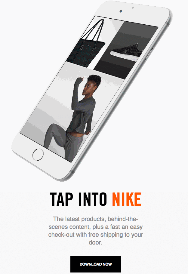
Why did this work?
Let’s start with the CTA: “Tap into Nike.” Fantastic wordplay! The definition of the phrase “tap into something” is the following, according to the Cambridge English Dictionary: “to manage to use something in a way that brings good results.”
So, Nike played with the meaning of the phrase and the meaning of the verb itself: the user will need to tap the screen to download and use the app. If you want to take it a step further, think of that as well: This phrase could’ve easily been followed by Nike’s tried-and-true “Just do it”!
The subject line is “The Nike App: Direct Access to Our Best.” It is an excellent example of a subject line that focuses on the app’s value. The app will give users direct access to the best content and features.

Key takeaways from app launch emails
Product launch emails are not for the faint of heart, as they need much more planning than just coming up with clever designs and CTAs. However, it is a powerful way of app promotion. Take some time and plan in advance all your app launch-related emails. Don’t forget to personalize your emails and create intrigue. And last but not least, always run A/B testing as it will help you understand your audience better and improve your following announcement emails.
Connect your Google Ads and Apple Search Ads accounts with App Radar

Latest Posts
Related Posts
Featured Posts
