Google Play Store Feature Graphic: Best ASO Practices
Google Play creatives are visual and promotional assets that developers use to showcase their apps or games on the Google Play Store. For apps to be published for mobile Android devices these include: an app icon, a feature graphic, screenshots, a promotional video and textual descriptions.
These assets are crucial for attracting users and encouraging them to download and engage with the app. Optimizing them is a key step in every app store optimization (ASO) strategy.
What is a feature graphic in Google Play?
Feature graphic has multiple uses on the Google Play store. It’s used as a cover image for an app’s preview video. It also appears in Google Play’s app collections & game recommendations, including adverts. Users will also encounter it while expanding organic search results.

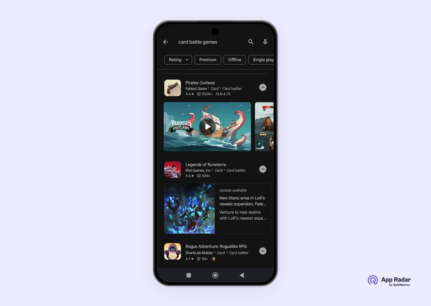
An example of feature graphics used as still frames for preview videos. Not all apps utilize preview videos on their product pages. Games are especially likely to do it.
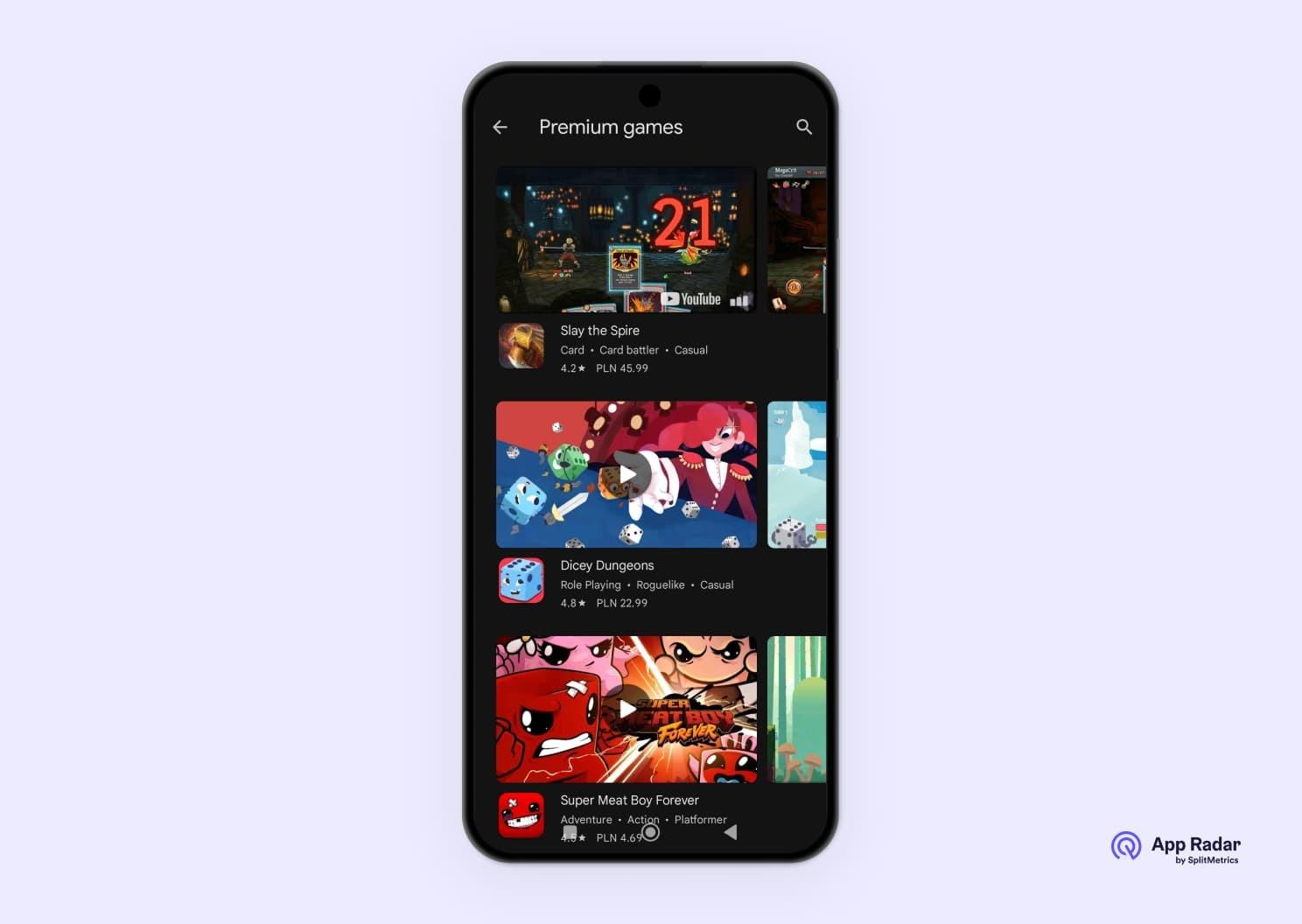
Google Play games tab. A collection of games showing video previews (Premium Games). Notice that some games rely only on imagery to convey their features, genre and style.
Why is feature graphic important for app store optimization (ASO?
The feature graphic is a big factor in attracting traffic to your app or a game, as it can be visible in highly prominent editorial spaces on Google Play, which are a key step in app discovery.
On an app’s store listing, it will boost the open rate of a preview video. Those can be essential to driving downloads, especially for games.
Users will see your feature graphic when they extend organic search results. Notice that it’s the second element to be visible, with the first being a description with information provided by the developer.
What are the requirements and specifications for feature graphics?
Technical requirements are simple: a feature graphic must be a JPEG or 24-bit PNG with no transparency, 1024 x 500 px, up to 15MB in size. Consider the following, highly recommended requirements listed on Google’s official help center as de facto obligatory:
- Keep key visual elements in the center of the graphic and avoid placing them near the borders, as they may be cut off in some instances, depending on the user interface format. Failure to comply may mean that the app or game won’t be eligible for these formats and lose a great opportunity for exposure and impressions. However, remember that if the preview graphic is used as a cover for a video, some elements at the very center might be covered by the “play” icon.
- Avoid redundant text and imagery (like the app icon or your logo), as in certain places they may be duplicated – in the organic search results for example (see our screenshot above for reference).
- Don’t show devices: mockup mobile phones occupy space best saved for your own visuals, become obsolete quickly and alienate users, who may be using different models or types of devices (like tablets).
- Use bigger, readable font sizes. If you have to use text, make it easily readable on a phone’s screen.
- Avoid text and imagery that involves Google Play and your app’s performance on it. Don’t use Google’s imagery or badges, or any branded imagery without having a clear permission to do so.
- Localize your copy: remember to have designated imagery for each target market.
Many of the suggestions offered there are related to optimal performance of your feature graphic and what you ultimately do with it also highly depends on your app’s or game’s unique visual style. Find our own advice and best practices below:
What are best practices for creating a feature graphic?
Feature Graphic is an important asset on Google Play, as it’s used in prominent places on Google Play. To best capitalize on the opportunity it offers, follow these design guidelines:
- Avoid white, black or dark gray backgrounds, as these may blend with the store’s own background. This may be challenging to apps with dark color schemes (like scary games) who we’d encourage to add some contrasting elements to their feature graphic. Take note, that we’ve observed Google experiment with darker background color palettes for the Play store, which is now (#131313). Experiments with even darker shades were reported by Androidpolice.com.
- Try to reduce text to the app’s title. At most, use a simple tagline if you have to (visit Google Play to see that most apps use only the title in their feature graphics, some rely only on images). Try to convey an app’s spirit, style and functionality with images first.
- Be careful with timed offers & seasonal communications: you can use them, but remember to update your creatives, as outside of their time frame they may work negatively for conversions. It’s best to leave seasonal campaigns for in-app events and use timeless messaging for your feature graphic.
Great examples of feature graphics in Google Play Store
There are many examples of great feature graphics on Google Play. There’s a notable difference between apps and games, as the latter are more likely to utilize just graphics and have preview videos on their listings. Here are examples of good designs from both worlds.
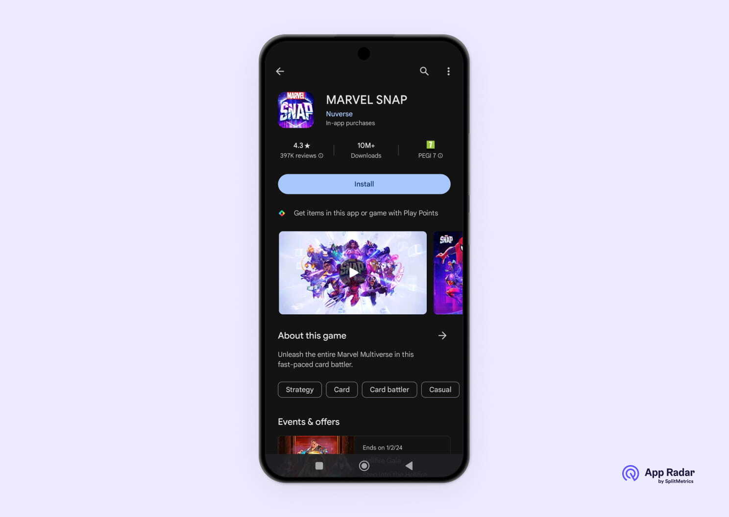
Marvel Snap delivers a good example of a feature graphic: key elements (known superheroes) are placed at the exact center. Bright color palette draws attention. The image is very different from the following screenshots of the game, so it also draws attention on an app’s product page. Ultimately, it functions well in all possible placements.
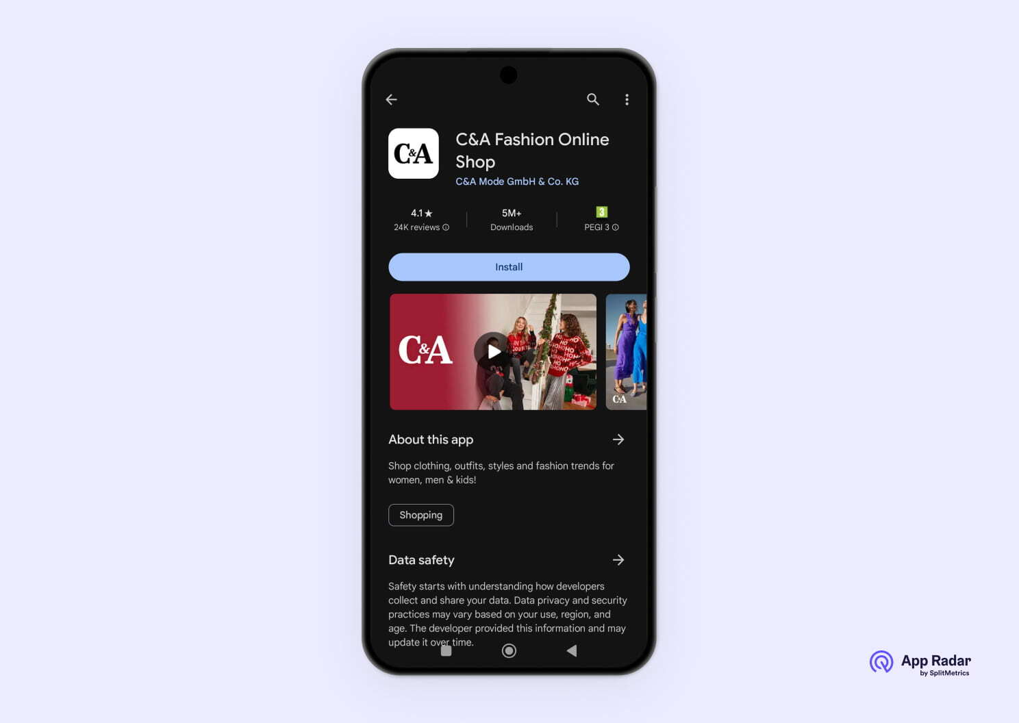
C&A decided to use holiday-appropriate color (red) and subtle visual cues (“Ho ho ho!” on a sweater) to highlight its seasonal offer on a simple, yet effective feature graphic.
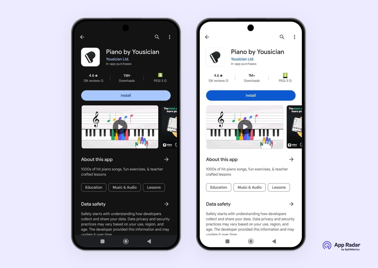
Piano by Yousician is a great example of feature graphic design. A clear and elegant image quickly conveys the functionality and unique selling point of the app: it offers an easy method of learning to play piano, giving simple guidance. It also works well in both available color schemes, despite using a gray background.
What are the best tools and resources for creating a feature graphic for your app?
To create compelling feature graphics, you’ll most likely rely on your app’s or game’s assets and design team. Feature graphics can have a significant impact on your tap-through rates and downloads and because of that they deserve a professional approach.
Those on a budget can use free image editing software, such as Gimp (for professional editing). For ease of use and plenty of graphic templates choose Canva (an online, subscription-based suite good for inexperienced users) or Visme. Platforms such as Hotpot.ai can help you prepare components to use in any graphic editing software, by removing backgrounds or applying entire styles to existing images. An AI generator will aid you greatly during the conceptual phase of designing banners to be used as feature graphics.
How to upload your feature graphic to Google Play Console?
Google Play feature graphic is uploaded through the Graphic Assets section within the Google Play Console. You’re obliged to do it in order to publish your store listing.
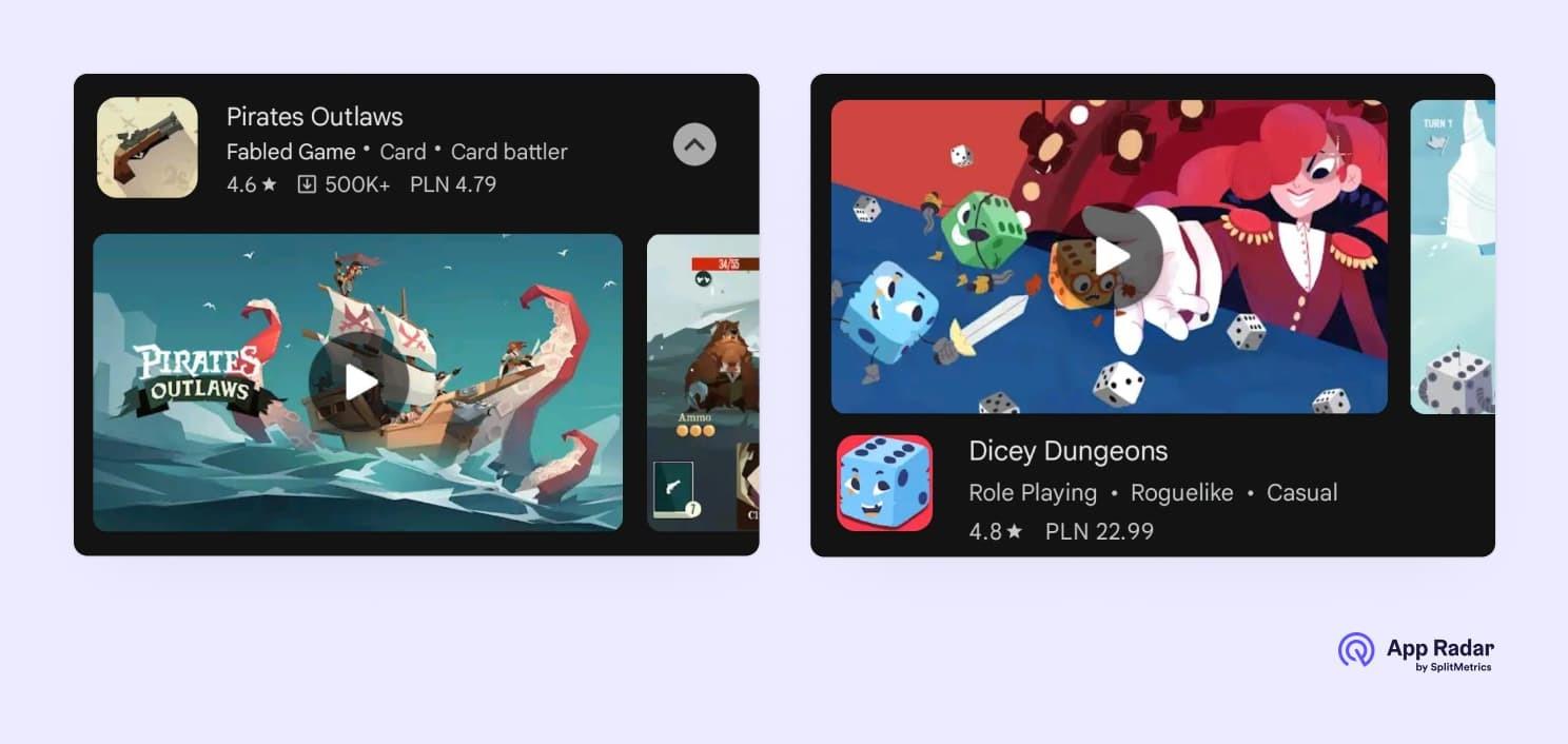
TIP: Consider not using your logo or any text at all, as these elements may be obstructed by the “Play” icon. Logo may be positioned slightly to the side (look below at earlier examples of Pirates Outlaws or Dicey Dungeon). This doesn’t have to be a problem, but we’d consider running A/B tests for best results. Putting an app’s or a game’s logo at the very center of the feature graphic is a very common practice.
Level up your ASO game
Google Play feature graphics are an important visual asset of your app or game. Featured in prominent placements, it offers a great opportunity to boost impressions, drive traffic and downloads. Make sure to not accept half-measures in their design. A/B testing is highly recommended in this case. SplitMetrics Optimize may be the perfect tool for that task.
Latest Posts


