Using App Store Listing Visuals to Make a Good First Impression
The saying goes “a picture is worth a thousand words” and I can’t argue with that. For most people imagery will stay ingrained in their minds much longer than a paragraph of words. In the case of mobile apps and games, we’re talking about your app store listing visual vs. textual elements. App store listing visuals make up the bulk of a person’s first impression of your app. While the text, as we learned in earlier lessons, helps your app rank higher in App Store and Google Play.
Why is the First Impression Important for App Success?
First impressions are important in many situations. Whether it’s choosing a date to the dance or an app to downloads, people rely heavily on their first impressions to make many life decisions.
The one users get of your app is vital to your success because it can determine if they download your app. As an app developer, publisher, or marketer, you strive to drive more download, first impressions are extremely important to your growth strategy.
App Store Listing Visuals that Drive Downloads
Your app store listing has 3 visual elements:
- App icon
- App screenshot
- App preview or promo video
Source: App Store
These 3 have to work together to form an appealing picture of your app, one that will convince users to want to download and use it.
Designing a Great App Icon
The app icon is front and center when it comes to apps. It serves as your logo and will represent your brand throughout all media and platforms, even outside of App Store and Google Play. As a result, you want to nail this down the first time.
Once your app is published, changing the app icon too often is a bad idea. You’ll lose brand recognition value and people might not be able to find your app because they’re looking for the old version. When you have a design, stick with it for a while.
Here are some tips to help you design a great app icon.
The icon is quite small and depending on device size, can be really miniature in size. For this reason, you want to avoid using too much text and too many colors.
I’d recommend picking 2 colors from your overall branding and using these. Don’t use text at all if you can. When you have to, limit yourself to 3 or so letters. The icon becomes difficult to decipher when there’s too many letters.
Source: App Store
Also, don’t include any actual images or photographs in your app icon. Apple and Google will reject your submission if you do. Keep to simple graphics and shapes.
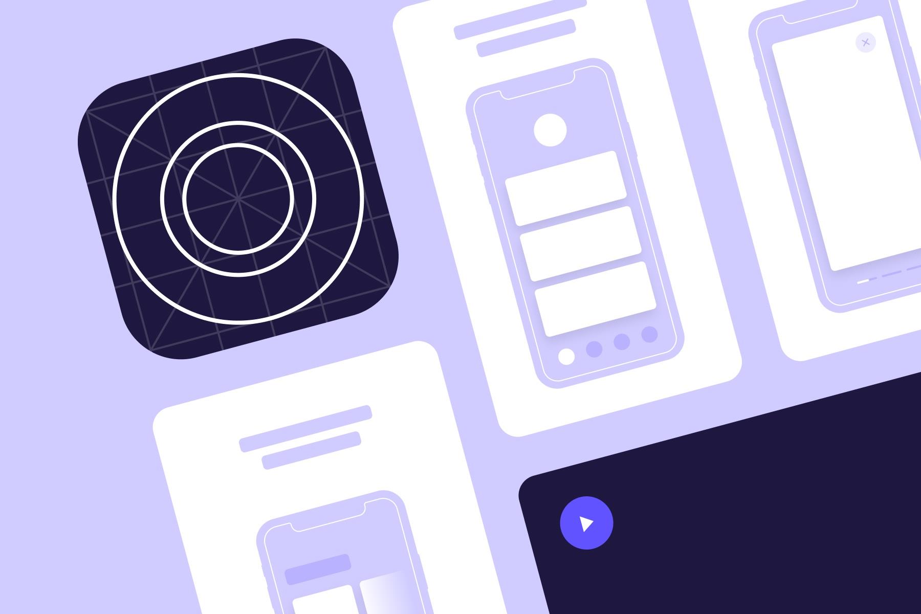
Your app icon should tell users a bit about what your app does. For example, many photo editing and photography apps will use a circle to represent a camera lens.
Source: App Store
After you’ve designed a couple options for your app icon, be sure to mock it up in places where it will be seen. These include the app stores, a mobile phone, social media, etc. Then you can be sure that your icon will look great no matter where it’s placed.
To summarize your app icon design:
- Design clean and not clustered
- Avoid text and photos
- Match colors to your branding
- Choose shapes that represent your app
Dive Deeper:
App Icon: Designing Android App Icon for Google Play
App Icon: How to Create an Appealing iOS App Icon
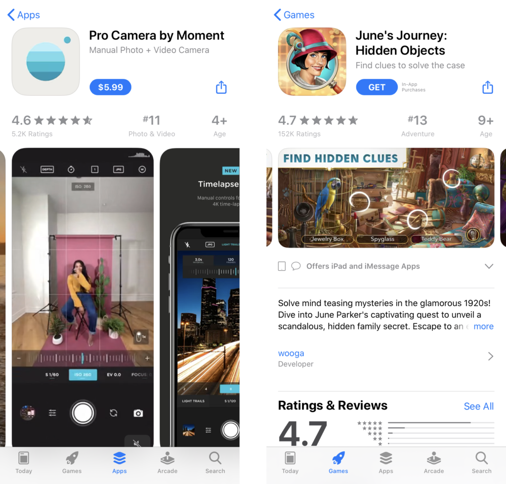
App Screenshots that Tell a Story
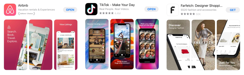
App screenshots enable users to get a sneak peek of your app before downloading or buying it. App Store gives you 10 slots and Google Play gives you 8. The best way to use this space is to create a storyline with your screenshots. Instead of designing each screenshot as a standalone graphic, you should aim to create a cohesive story with each slot. A good way to plot it out is to mimic how a user would move through your app after they just downloaded it.
The first screenshot is the most important. You want to highlight your main and most appealing feature here. Use emotion filled words to draw people in and get them interested in what else your app can do.
Source: App Store
For App Store, specifically, your app screenshots have to be actual snapshots of your app. You can’t use abstract designs. Doing so will get your submission rejected. You can use the same screenshots for both App Store and Google Play. If you want to do so, I would recommend designing with App Store guidelines in mind because they are stricter than Google Play.
Don’t forget about providing value to your potential users. They want to know how they’ll benefit from downloading your app. The text that accompanies each screenshot should explain this value in a few short sentences.
Again, keep the entire design simple and easy to digest. People get overwhelmed when there are too many elements in an app screenshot. You want to guide a person’s eye to the feature you’re highlighting, rather than overload them with too much information. Stick with a clean design that matches the colors used in your app icon and branding.
Source: App Store
Lastly, the orientation of your screenshots should match how users engage with your app. For example, many photo editing and social media apps are meant to be used in vertical or portrait orientation. As a result, their app screenshots are also portrait. On the other hand, many mobile games are played in horizontal or landscape orientation. So their app screenshots are landscape. You always want to present your app the way users will interact with it.
Dive Deeper:
App Screenshot Tools
Android App Screenshot Sizes and Guidelines for Google Play
iOS App Screenshot Sizes and Guidelines for the Apple App Store
To summarize your app screenshots design:
- Clean and uncluttered
- Text describes value of the feature
- Most appealing feature in the first screenshot
- Screenshots come together to build a story
- Use actual screens from your app
- Match color to app icon and branding
- Choose orientation portrait or landscape
App Preview or Promo Video Act as a Trailer for Your App
The app preview video (App Store) or promo video (Google Play) is basically a trailer for your app. When you’re filming and editing the video, think of what would excite people about your app. You want to highlight the most interesting parts of your app in the video.
Once more, App Store requires that the entire video is filmed as a screen recording of your app. Any footage filmed outside of your app will cause your submission to be rejected.
For Google Play, your video has to be hosted on Youtube as a public or unlisted video that is also unmonetized.
Like with your app screenshots, your app video’s orientation has to match how users will interact with it. This is especially important for mobile games, as most mobile games do include a preview or promo video to show off gameplay. Potential players want to see what their journey in your mobile game will look like. If your game’s video is landscape, then people will expect to be playing your game in a landscape orientation.
Source: Harry Potter: Hogwarts Mystery on App Store
Videos on Google Play can be longer than 30 seconds but for App Store 30 seconds is the limit. However, I recommend that you keep your videos to 30 seconds max, anyways. That’s because people’s attention spans aren’t that long. They’ll pay close attention in the first 5 or maybe 10 seconds and probably drift off after that. Consequently, your app’s most prominent features need to be showcased in the first few seconds. You have to hook people right when the video starts playing.
Lastly, a lot of people watch videos on their phones with the sound off. You have to make sure your video is understandable even with the sound off. You can do so by integrating dynamic text elements that caption what’s going on in the video.
To summarize your app video design:
- 30 seconds or less
- Engage viewers in the first 5-10 seconds
- Show off most appealing features
- Treat video as a trailer
- Use dynamic text elements
Dive Deeper:
Differences for app videos on Google Play Store and Apple App Store
App Preview Video: Showcasing Your iOS App in App Store
App Promo Video: How to Create a Great Promo Video for Google Play
You now know how to create great app store listing visuals that will drive downloads. The next step is focusing on keeping your ratings high by keeping your users happy. That’s in the next lesson.
No Time to Design?
Let Our In-House Design Team Handle it
Contact Us TodayLatest Posts

Academy Lessons

Continue lessons
